
Are you staring at your screen, trying to choose the right logo approach for your brand? You’re not alone. Setting your brand’s visual foundation is no small task, and picking between a wordmark or symbol for your brand identity can feel overwhelming. While giants like Apple shine with their fruit logomark, other brands simply dominate with unmistakable wordmarks. The truth is, making the wrong choice could leave you stuck with a logo that holds your brand back. Combination marks are essential for building strong brand identities that leave a lasting impression. Consider this your roadmap to getting it right.
Understanding Logo Types
Understanding the different types of logos is crucial for businesses aiming to create a recognisable brand identity. A logo is more than just a visual mark; it’s a symbol that encapsulates a company’s essence and makes it easily identifiable. There are several types of logos, each with unique characteristics and suited to different business needs:
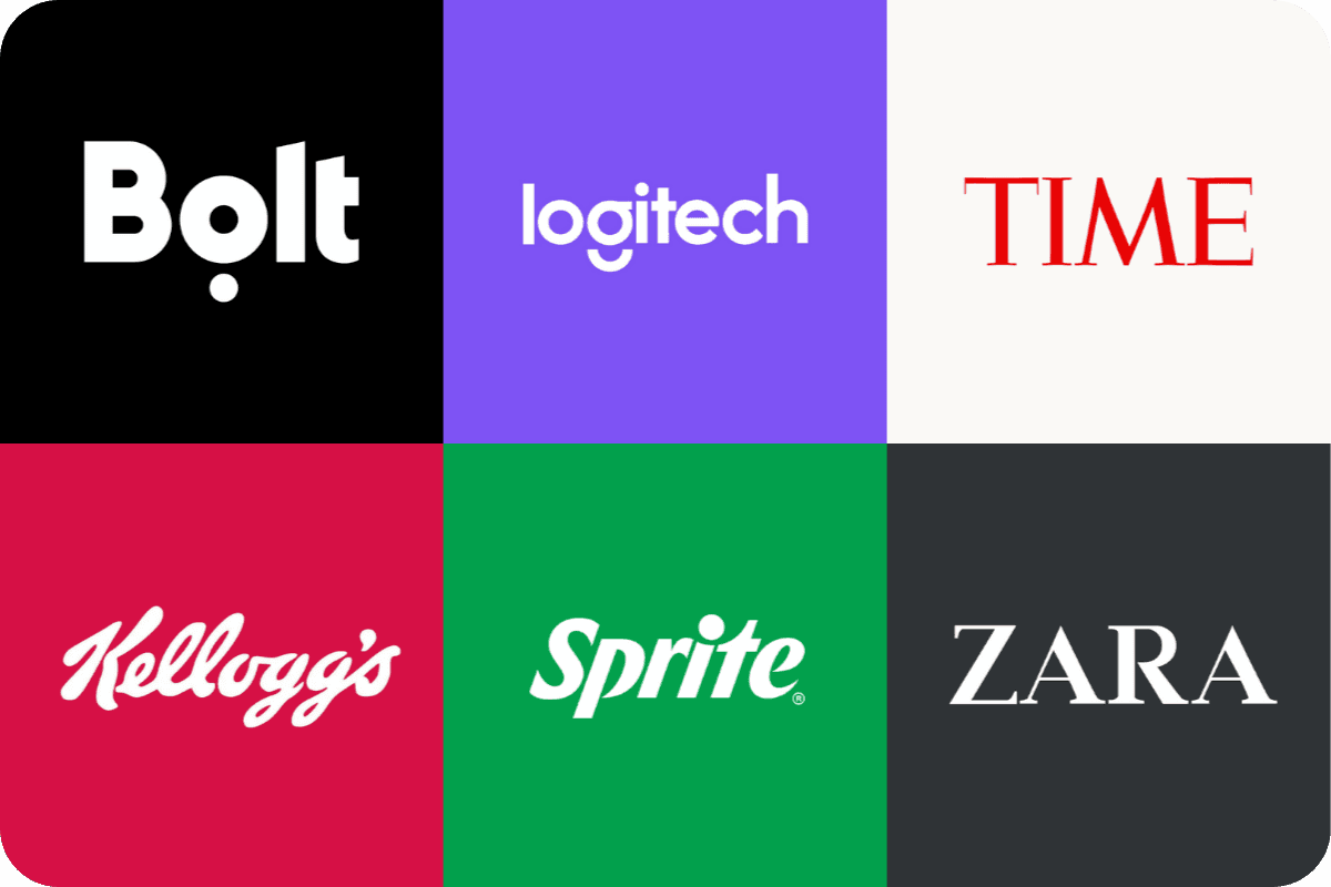
Wordmarks: These logos use the company’s name in a stylised typeface. They are ideal for businesses with distinctive names, like Google or Coca-Cola.
Lettermarks: Also known as monogram logos, these use initials to create a simple yet effective brand mark. Think of IBM (International Business Machines) or HBO.
Abstract Logos: These logos use abstract shapes and forms to represent the brand. They are versatile and can convey complex ideas in a simple visual form, like the Pepsi logo.
Pictorial Marks: These are graphic-based logos that depict a recognisable image, such as the Apple logo or Twitter’s bird.
Letterforms: These logos use a single letter to represent the brand, like McDonald’s iconic ‘M’.
Combination Marks: These logos combine a wordmark or lettermark with a pictorial mark, abstract mark, or mascot. Examples include Doritos and Lacoste.
Mascot Logos: These logos feature a character or mascot that represents the brand, like the KFC Colonel or the Michelin Man.
Each type of logo has its strengths and is suitable for different types of businesses, helping to create a recognisable brand identity.
Wordmark vs Logomark
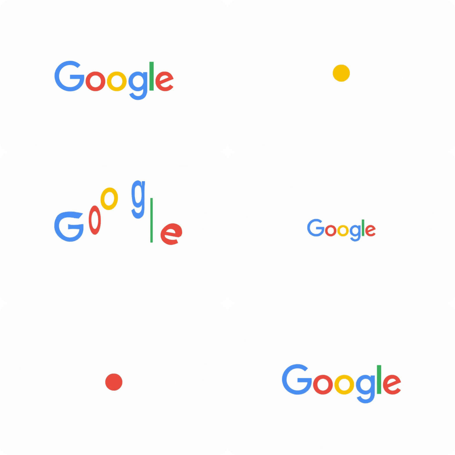
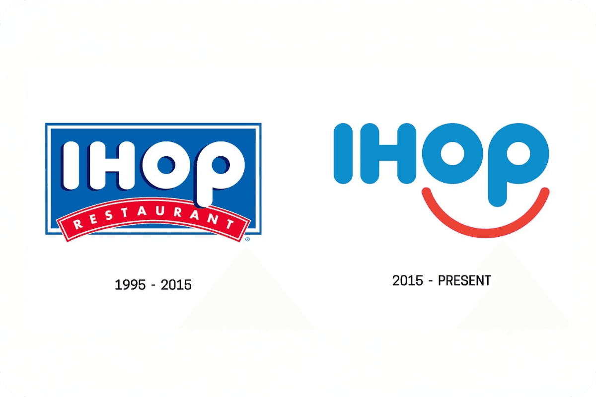
Let’s clear the air about these two distinct approaches to brand identity. A wordmark is your brand name transformed into a distinctive visual signature through typography alone. Think Google’s iconic letterforms or FedEx’s clever use of negative space. Wordmarks use the company name in a stylised typeface to enhance brand recognition.
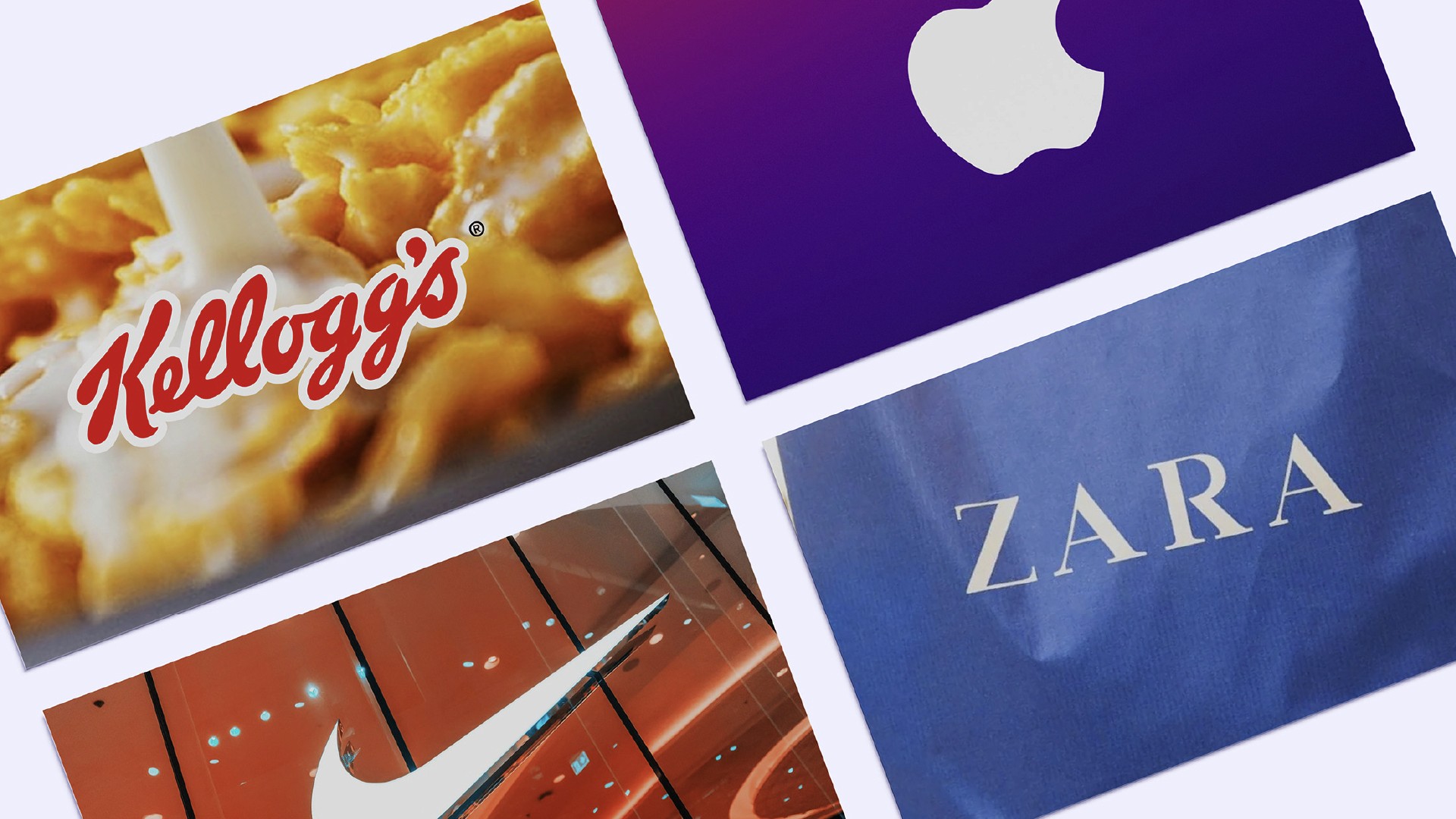
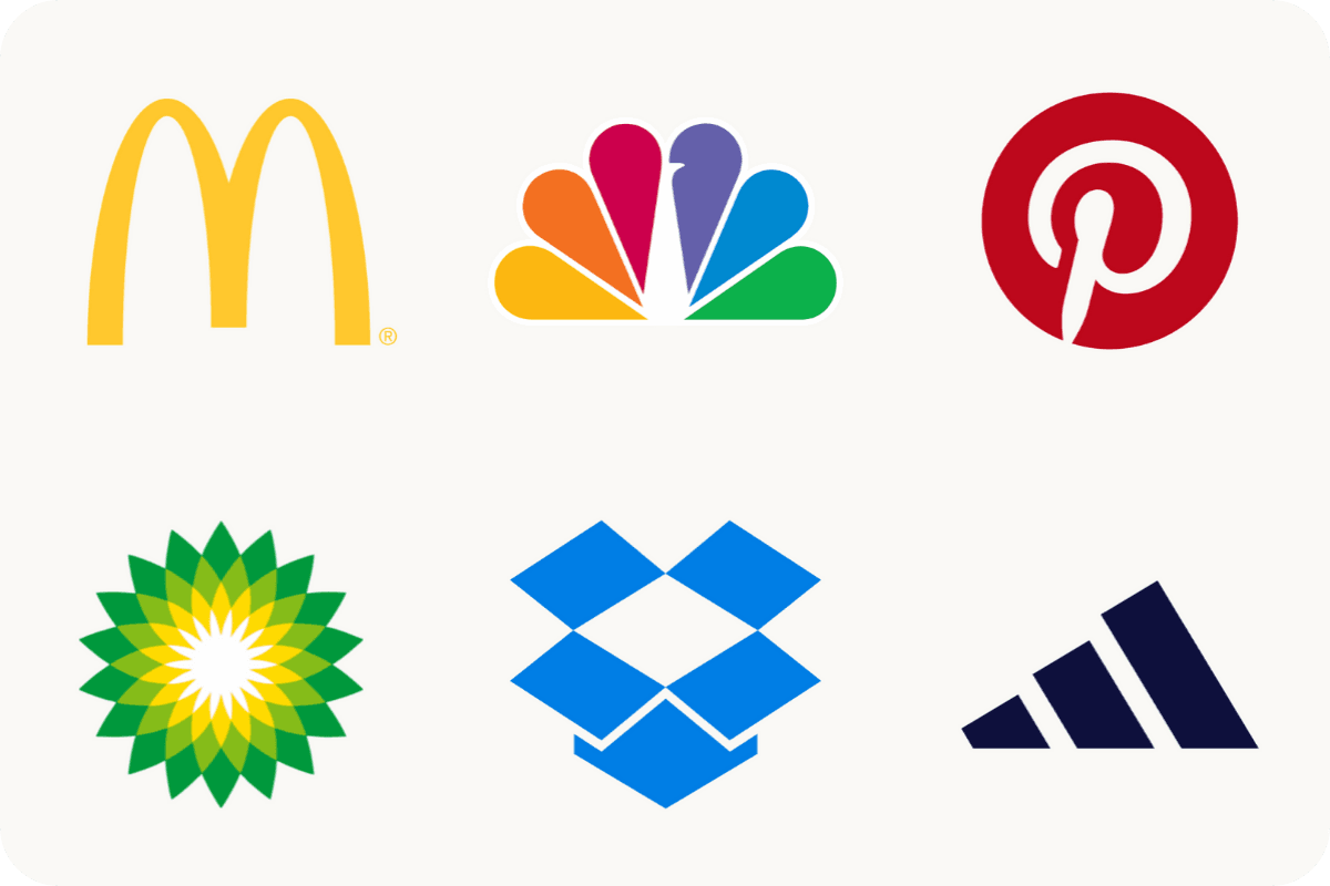
On the flip hand, a symbol (or logomark) is a purely visual element that represents your brand without any text - picture Apple’s bitten fruit or Nike’s swoosh. These logomarks are designed to distill your brand’s essence into a single, memorable visual that can work across any medium. They rely on shape, colour, and visual metaphor to tell your brand’s story without needing a single word. Pictorial marks are a type of brand marks that depict a recognisable image.
A lettermark logo uses initials of the company name for minimalist design, making it ideal for businesses with long names.

The Power of Wordmarks
Wordmarks excel in several key areas that make them particularly attractive for certain brands:
A well-designed wordmark using the company's name can improve brand identity and recognition. This type of logo is straightforward and easy to remember, making it an excellent choice for businesses looking to establish a strong presence. By focusing on typography and design, wordmarks can effectively convey the essence of the brand while maintaining visual appeal.
Upsides:
Flexibility in Evolution: Like a chameleon of the brand world, wordmarks can adapt and evolve with your business without losing recognition. You can adjust typography, spacing, and colour while maintaining brand equity.
Name Recognition: For new brands, especially, wordmarks serve double duty - they're both your logo and your name in one complete package. This helps build brand recognition from day one.
Cost-Effective: With no complex symbolic elements to design, wordmarks often require less initial investment - a crucial consideration for startups and small businesses.
Pitfalls:
Standing Out: In a text-heavy digital world, creating a truly distinctive wordmark requires exceptional typography skills.
Length Limitations: Longer brand names can become unwieldy, especially when scaling down for mobile devices or social media icons.
The Strength In Symbol Logos
When it comes to symbols, the game changes entirely. Beyond just looking sharp, symbols pack a powerful punch that can transform your brand. A logo symbol, like Apple's or Twitter's, can create immediate brand recognition by visually representing the brand's image or story. But before you jump in, here’s what you need to know:
Upsides:
Universal Communication: A well-designed logomark speaks every language, giving local brands the foundation they need to turn into global players.
Instant Recognition: Our brains process images faster than text. A distinctive symbol can create immediate brand recognition.
Versatile Applications: From app icons to billboards, logomarks maintain their impact at any size - often outperforming wordmarks in smaller spaces like app icons or favicon displays.
Pitfalls:
Time to Build Recognition: Unless you're Apple or Nike, it takes significant time and marketing investment for people to associate your logomark with your brand.
Complex Design Process: Creating a meaningful, unique symbol that captures your brand essence requires deeper strategic thinking and design expertise.
Combination Marks: A Hybrid Approach
Combination marks are a versatile and powerful type of logo that merges a wordmark or lettermark with a pictorial mark, abstract mark, or mascot. This hybrid approach offers the best of both worlds, providing the clarity of text with the visual appeal of an image. Combination marks are particularly effective in building brand recognition, especially for small businesses in competitive markets.
One of the key advantages of combination marks is their flexibility. They can be used in various contexts, from business cards and marketing materials to digital platforms and storefront signage. This adaptability makes them a popular choice for brands looking to create a unique and memorable brand image.
Several well-known companies use combination marks to great effect. For instance, Mastercard combines its name with two overlapping circles, creating a logo that is both recognisable and symbolic. Lacoste uses a combination of its name and the iconic crocodile, while Burger King integrates its name within a stylised burger. Doritos also employs a combination mark, blending its name with a dynamic triangular shape.
By leveraging the strengths of both text and imagery, combination marks can help businesses establish a strong and recognisable brand identity.
Making the Right Choice
Let’s face it - choosing between a wordmark and logomark is more about strategy than aesthetics. Your choice should align with your business goals and target audience, but also consider where you are in your brand journey. Here’s how to navigate this decision with confidence:
Industry Context Matters
Different industries have different visual languages. Tech companies like Microsoft and IBM often lean towards wordmarks because they need to communicate reliability and with professionalism. Meanwhile, fashion brands like Chanel and Gucci frequently embrace symbols because they're selling an aspirational lifestyle that transcends language.
Know Your Audience
Your target market's preferences and behaviours should guide your choice. Here's why:
Age Demographics: Younger audiences tend to connect more with visual symbols that can become social currency. Just look at how TikTok's musical note symbol has become instantly recognisable among Gen Z. However, professional services targeting mature business clients often find more success with clear, authoritative wordmarks - think Ernst & Young or Deloitte.
Geographic Reach: As mentioned, a logomark transcends alphabet and language barriers. While wordmarks may require translation or adaptation, a logomark retains its impact, speaking the universal language of visual communication.

Brand Personality & Values
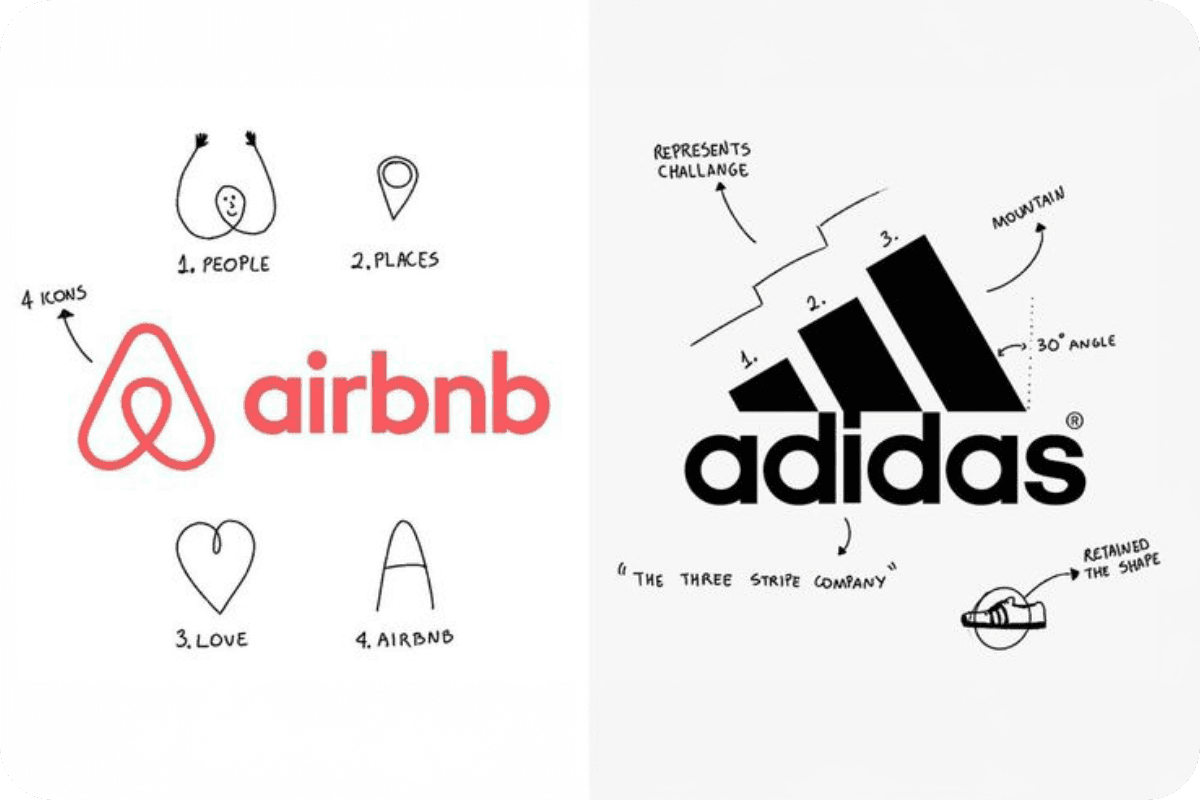
Your logo isn't just a design - it's your brand's visual handshake with the world. Your choice should reflect who you are as a brand:
Heritage Brands: Companies with rich histories often benefit from wordmarks that showcase their established legacy. Think about how The New York Times' wordmark communicates authority and tradition.
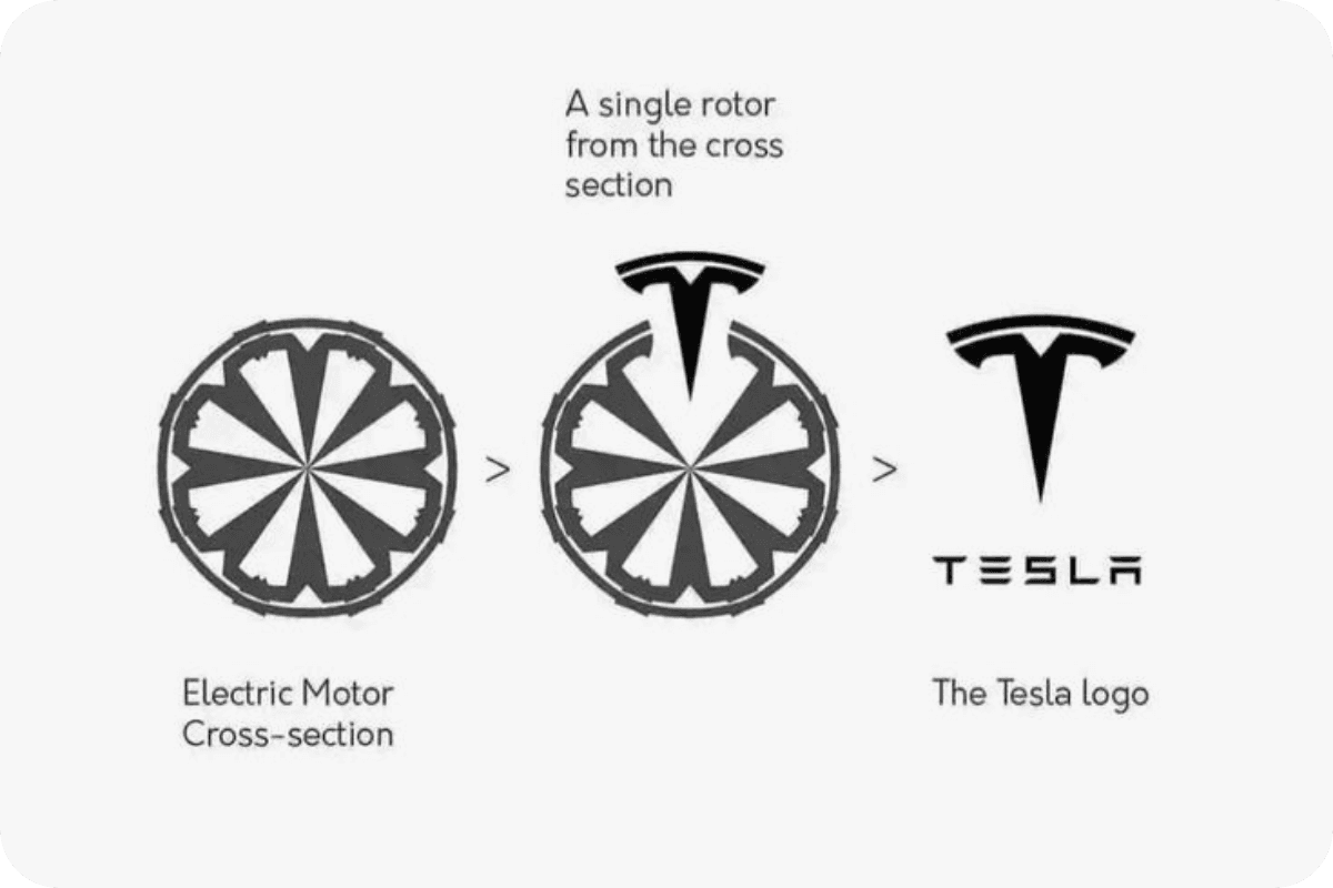
Innovative Disruptors: Forward-thinking brands might opt for symbols that suggest transformation and progress. Tesla's stylized 'T' represents not just the letter, but also evokes the image of an electric arc, perfectly aligning with their innovative spirit.
Practical Considerations
When it comes to real-world applications, your logo needs to work harder than ever before. Digital-first businesses must consider how their logo will perform across the ever-shrinking real estate of social media avatars and app icons - just look at how Spotify's symbol maintains its impact even at the smallest sizes. Meanwhile, retail businesses need their logos to work double duty - grabbing attention on storefront signage while still looking sharp on the finest details of product packaging.
Logo Design Best Practices
Creating a logo is a critical step in establishing a recognisable brand identity. Here are some best practices to ensure your logo design hits the mark:
Keep it Simple: Simplicity is key. A simple logo is more versatile and easier to recognise. Avoid overly complex designs and excessive colors.
Make it Scalable: Your logo should look good at any size, from a tiny social media icon to a large billboard. Ensure it maintains its integrity and legibility across different resolutions.
Use Typography Effectively: Typography plays a crucial role in logo design. Choose a font that is legible and reflects your brand’s personality. Whether it’s bold and modern or elegant and classic, the right typography can make a significant impact.
Use Colour Wisely: Colour is a powerful tool in logo design. Select colors that align with your brand’s identity and evoke the desired emotions. Remember, different colors can convey different messages.
Make it Memorable: A memorable logo is one that sticks in people’s minds. Aim for a unique and distinctive design that stands out from the competition.
Reflect the Brand’s Identity: Your logo should embody your brand’s mission, vision, and values. Consider your target audience and what you want your logo to communicate about your brand.
Test the Logo: Before finalising your logo, test it in various contexts and sizes. Ensure it looks good and is effective across different mediums, from digital platforms to print materials.
By following these best practices, you can create a logo that not only looks great but also helps build a strong and recognisable brand identity.
The Future of Logo Design: Why Wordmark Logos Are Having a Moment
As we look toward the horizon of brand identity, we’re seeing an interesting shift. The digital-first world is driving a renaissance in wordmark design. Here’s why:
Digital Adaptability: Wordmarks often perform better across various screen sizes and digital platforms. Wordmark logos emphasize a brand's name using distinctive typography and minimalistic design, enhancing brand recognition.
Brand Authenticity: In an era where authenticity matters more than ever, wordmarks offer a more direct, honest approach to brand identity.
Flexible Evolution: As brands need to pivot and evolve more quickly than ever, wordmarks offer greater flexibility for change while maintaining recognition.
Final Word
The choice between a wordmark and symbol isn't just about design preference - it's about choosing the right tool for your brand's journey. While logomarks can create powerful brand recognition over time, wordmarks offer immediate clarity and flexibility that's particularly valuable in today's fast-paced digital landscape. The key is understanding your brand's unique needs, context, and future aspirations.
Looking at Our Portfolio
Each brand tells its own story. Here's a glimpse of how we've helped make their mark, from ambitious startups choosing their first logo to industry-leading powerhouses with established logos.
Not sure which direction to take? about hitting the mark with the right logo choice - whether that's a standout wordmark or a symbol that speaks volumes. Book a call to explore your options.
Are you staring at your screen, trying to choose the right logo approach for your brand? You’re not alone. Setting your brand’s visual foundation is no small task, and picking between a wordmark or symbol for your brand identity can feel overwhelming. While giants like Apple shine with their fruit logomark, other brands simply dominate with unmistakable wordmarks. The truth is, making the wrong choice could leave you stuck with a logo that holds your brand back. Combination marks are essential for building strong brand identities that leave a lasting impression. Consider this your roadmap to getting it right.
Understanding Logo Types
Understanding the different types of logos is crucial for businesses aiming to create a recognisable brand identity. A logo is more than just a visual mark; it’s a symbol that encapsulates a company’s essence and makes it easily identifiable. There are several types of logos, each with unique characteristics and suited to different business needs:
Wordmarks: These logos use the company’s name in a stylised typeface. They are ideal for businesses with distinctive names, like Google or Coca-Cola.
Lettermarks: Also known as monogram logos, these use initials to create a simple yet effective brand mark. Think of IBM (International Business Machines) or HBO.
Abstract Logos: These logos use abstract shapes and forms to represent the brand. They are versatile and can convey complex ideas in a simple visual form, like the Pepsi logo.
Pictorial Marks: These are graphic-based logos that depict a recognisable image, such as the Apple logo or Twitter’s bird.
Letterforms: These logos use a single letter to represent the brand, like McDonald’s iconic ‘M’.
Combination Marks: These logos combine a wordmark or lettermark with a pictorial mark, abstract mark, or mascot. Examples include Doritos and Lacoste.
Mascot Logos: These logos feature a character or mascot that represents the brand, like the KFC Colonel or the Michelin Man.
Each type of logo has its strengths and is suitable for different types of businesses, helping to create a recognisable brand identity.
Wordmark vs Logomark
Let’s clear the air about these two distinct approaches to brand identity. A wordmark is your brand name transformed into a distinctive visual signature through typography alone. Think Google’s iconic letterforms or FedEx’s clever use of negative space. Wordmarks use the company name in a stylised typeface to enhance brand recognition.

On the flip hand, a symbol (or logomark) is a purely visual element that represents your brand without any text - picture Apple’s bitten fruit or Nike’s swoosh. These logomarks are designed to distill your brand’s essence into a single, memorable visual that can work across any medium. They rely on shape, colour, and visual metaphor to tell your brand’s story without needing a single word. Pictorial marks are a type of brand marks that depict a recognisable image.
A lettermark logo uses initials of the company name for minimalist design, making it ideal for businesses with long names.

The Power of Wordmarks
Wordmarks excel in several key areas that make them particularly attractive for certain brands:
A well-designed wordmark using the company's name can improve brand identity and recognition. This type of logo is straightforward and easy to remember, making it an excellent choice for businesses looking to establish a strong presence. By focusing on typography and design, wordmarks can effectively convey the essence of the brand while maintaining visual appeal.
Upsides:
Flexibility in Evolution: Like a chameleon of the brand world, wordmarks can adapt and evolve with your business without losing recognition. You can adjust typography, spacing, and colour while maintaining brand equity.
Name Recognition: For new brands, especially, wordmarks serve double duty - they're both your logo and your name in one complete package. This helps build brand recognition from day one.
Cost-Effective: With no complex symbolic elements to design, wordmarks often require less initial investment - a crucial consideration for startups and small businesses.
Pitfalls:
Standing Out: In a text-heavy digital world, creating a truly distinctive wordmark requires exceptional typography skills.
Length Limitations: Longer brand names can become unwieldy, especially when scaling down for mobile devices or social media icons.

The Strength In Symbol Logos
When it comes to symbols, the game changes entirely. Beyond just looking sharp, symbols pack a powerful punch that can transform your brand. A logo symbol, like Apple's or Twitter's, can create immediate brand recognition by visually representing the brand's image or story. But before you jump in, here’s what you need to know:
Upsides:
Universal Communication: A well-designed logomark speaks every language, giving local brands the foundation they need to turn into global players.
Instant Recognition: Our brains process images faster than text. A distinctive symbol can create immediate brand recognition.
Versatile Applications: From app icons to billboards, logomarks maintain their impact at any size - often outperforming wordmarks in smaller spaces like app icons or favicon displays.
Pitfalls:
Time to Build Recognition: Unless you're Apple or Nike, it takes significant time and marketing investment for people to associate your logomark with your brand.
Complex Design Process: Creating a meaningful, unique symbol that captures your brand essence requires deeper strategic thinking and design expertise.

Combination Marks: A Hybrid Approach
Combination marks are a versatile and powerful type of logo that merges a wordmark or lettermark with a pictorial mark, abstract mark, or mascot. This hybrid approach offers the best of both worlds, providing the clarity of text with the visual appeal of an image. Combination marks are particularly effective in building brand recognition, especially for small businesses in competitive markets.
One of the key advantages of combination marks is their flexibility. They can be used in various contexts, from business cards and marketing materials to digital platforms and storefront signage. This adaptability makes them a popular choice for brands looking to create a unique and memorable brand image.
Several well-known companies use combination marks to great effect. For instance, Mastercard combines its name with two overlapping circles, creating a logo that is both recognisable and symbolic. Lacoste uses a combination of its name and the iconic crocodile, while Burger King integrates its name within a stylised burger. Doritos also employs a combination mark, blending its name with a dynamic triangular shape.
By leveraging the strengths of both text and imagery, combination marks can help businesses establish a strong and recognisable brand identity.
Making the Right Choice
Let’s face it - choosing between a wordmark and logomark is more about strategy than aesthetics. Your choice should align with your business goals and target audience, but also consider where you are in your brand journey. Here’s how to navigate this decision with confidence:
Industry Context Matters
Different industries have different visual languages. Tech companies like Microsoft and IBM often lean towards wordmarks because they need to communicate reliability and with professionalism. Meanwhile, fashion brands like Chanel and Gucci frequently embrace symbols because they're selling an aspirational lifestyle that transcends language.

Know Your Audience
Your target market's preferences and behaviours should guide your choice. Here's why:
Age Demographics: Younger audiences tend to connect more with visual symbols that can become social currency. Just look at how TikTok's musical note symbol has become instantly recognisable among Gen Z. However, professional services targeting mature business clients often find more success with clear, authoritative wordmarks - think Ernst & Young or Deloitte.
Geographic Reach: As mentioned, a logomark transcends alphabet and language barriers. While wordmarks may require translation or adaptation, a logomark retains its impact, speaking the universal language of visual communication.

Brand Personality & Values
Your logo isn't just a design - it's your brand's visual handshake with the world. Your choice should reflect who you are as a brand:
Heritage Brands: Companies with rich histories often benefit from wordmarks that showcase their established legacy. Think about how The New York Times' wordmark communicates authority and tradition.
Innovative Disruptors: Forward-thinking brands might opt for symbols that suggest transformation and progress. Tesla's stylized 'T' represents not just the letter, but also evokes the image of an electric arc, perfectly aligning with their innovative spirit.

Practical Considerations
When it comes to real-world applications, your logo needs to work harder than ever before. Digital-first businesses must consider how their logo will perform across the ever-shrinking real estate of social media avatars and app icons - just look at how Spotify's symbol maintains its impact even at the smallest sizes. Meanwhile, retail businesses need their logos to work double duty - grabbing attention on storefront signage while still looking sharp on the finest details of product packaging.
Logo Design Best Practices
Creating a logo is a critical step in establishing a recognisable brand identity. Here are some best practices to ensure your logo design hits the mark:
Keep it Simple: Simplicity is key. A simple logo is more versatile and easier to recognise. Avoid overly complex designs and excessive colors.
Make it Scalable: Your logo should look good at any size, from a tiny social media icon to a large billboard. Ensure it maintains its integrity and legibility across different resolutions.
Use Typography Effectively: Typography plays a crucial role in logo design. Choose a font that is legible and reflects your brand’s personality. Whether it’s bold and modern or elegant and classic, the right typography can make a significant impact.
Use Colour Wisely: Colour is a powerful tool in logo design. Select colors that align with your brand’s identity and evoke the desired emotions. Remember, different colors can convey different messages.
Make it Memorable: A memorable logo is one that sticks in people’s minds. Aim for a unique and distinctive design that stands out from the competition.
Reflect the Brand’s Identity: Your logo should embody your brand’s mission, vision, and values. Consider your target audience and what you want your logo to communicate about your brand.
Test the Logo: Before finalising your logo, test it in various contexts and sizes. Ensure it looks good and is effective across different mediums, from digital platforms to print materials.
By following these best practices, you can create a logo that not only looks great but also helps build a strong and recognisable brand identity.
The Future of Logo Design: Why Wordmark Logos Are Having a Moment
As we look toward the horizon of brand identity, we’re seeing an interesting shift. The digital-first world is driving a renaissance in wordmark design. Here’s why:
Digital Adaptability: Wordmarks often perform better across various screen sizes and digital platforms. Wordmark logos emphasize a brand's name using distinctive typography and minimalistic design, enhancing brand recognition.
Brand Authenticity: In an era where authenticity matters more than ever, wordmarks offer a more direct, honest approach to brand identity.
Flexible Evolution: As brands need to pivot and evolve more quickly than ever, wordmarks offer greater flexibility for change while maintaining recognition.

Final Word
The choice between a wordmark and symbol isn't just about design preference - it's about choosing the right tool for your brand's journey. While logomarks can create powerful brand recognition over time, wordmarks offer immediate clarity and flexibility that's particularly valuable in today's fast-paced digital landscape. The key is understanding your brand's unique needs, context, and future aspirations.
Looking at Our Portfolio
Each brand tells its own story. Here's a glimpse of how we've helped make their mark, from ambitious startups choosing their first logo to industry-leading powerhouses with established logos.
Not sure which direction to take? about hitting the mark with the right logo choice - whether that's a standout wordmark or a symbol that speaks volumes. Book a call to explore your options.
Are you staring at your screen, trying to choose the right logo approach for your brand? You’re not alone. Setting your brand’s visual foundation is no small task, and picking between a wordmark or symbol for your brand identity can feel overwhelming. While giants like Apple shine with their fruit logomark, other brands simply dominate with unmistakable wordmarks. The truth is, making the wrong choice could leave you stuck with a logo that holds your brand back. Combination marks are essential for building strong brand identities that leave a lasting impression. Consider this your roadmap to getting it right.
Understanding Logo Types
Understanding the different types of logos is crucial for businesses aiming to create a recognisable brand identity. A logo is more than just a visual mark; it’s a symbol that encapsulates a company’s essence and makes it easily identifiable. There are several types of logos, each with unique characteristics and suited to different business needs:
Wordmarks: These logos use the company’s name in a stylised typeface. They are ideal for businesses with distinctive names, like Google or Coca-Cola.
Lettermarks: Also known as monogram logos, these use initials to create a simple yet effective brand mark. Think of IBM (International Business Machines) or HBO.
Abstract Logos: These logos use abstract shapes and forms to represent the brand. They are versatile and can convey complex ideas in a simple visual form, like the Pepsi logo.
Pictorial Marks: These are graphic-based logos that depict a recognisable image, such as the Apple logo or Twitter’s bird.
Letterforms: These logos use a single letter to represent the brand, like McDonald’s iconic ‘M’.
Combination Marks: These logos combine a wordmark or lettermark with a pictorial mark, abstract mark, or mascot. Examples include Doritos and Lacoste.
Mascot Logos: These logos feature a character or mascot that represents the brand, like the KFC Colonel or the Michelin Man.
Each type of logo has its strengths and is suitable for different types of businesses, helping to create a recognisable brand identity.
Wordmark vs Logomark
Let’s clear the air about these two distinct approaches to brand identity. A wordmark is your brand name transformed into a distinctive visual signature through typography alone. Think Google’s iconic letterforms or FedEx’s clever use of negative space. Wordmarks use the company name in a stylised typeface to enhance brand recognition.

On the flip hand, a symbol (or logomark) is a purely visual element that represents your brand without any text - picture Apple’s bitten fruit or Nike’s swoosh. These logomarks are designed to distill your brand’s essence into a single, memorable visual that can work across any medium. They rely on shape, colour, and visual metaphor to tell your brand’s story without needing a single word. Pictorial marks are a type of brand marks that depict a recognisable image.
A lettermark logo uses initials of the company name for minimalist design, making it ideal for businesses with long names.

The Power of Wordmarks
Wordmarks excel in several key areas that make them particularly attractive for certain brands:
A well-designed wordmark using the company's name can improve brand identity and recognition. This type of logo is straightforward and easy to remember, making it an excellent choice for businesses looking to establish a strong presence. By focusing on typography and design, wordmarks can effectively convey the essence of the brand while maintaining visual appeal.
Upsides:
Flexibility in Evolution: Like a chameleon of the brand world, wordmarks can adapt and evolve with your business without losing recognition. You can adjust typography, spacing, and colour while maintaining brand equity.
Name Recognition: For new brands, especially, wordmarks serve double duty - they're both your logo and your name in one complete package. This helps build brand recognition from day one.
Cost-Effective: With no complex symbolic elements to design, wordmarks often require less initial investment - a crucial consideration for startups and small businesses.
Pitfalls:
Standing Out: In a text-heavy digital world, creating a truly distinctive wordmark requires exceptional typography skills.
Length Limitations: Longer brand names can become unwieldy, especially when scaling down for mobile devices or social media icons.

The Strength In Symbol Logos
When it comes to symbols, the game changes entirely. Beyond just looking sharp, symbols pack a powerful punch that can transform your brand. A logo symbol, like Apple's or Twitter's, can create immediate brand recognition by visually representing the brand's image or story. But before you jump in, here’s what you need to know:
Upsides:
Universal Communication: A well-designed logomark speaks every language, giving local brands the foundation they need to turn into global players.
Instant Recognition: Our brains process images faster than text. A distinctive symbol can create immediate brand recognition.
Versatile Applications: From app icons to billboards, logomarks maintain their impact at any size - often outperforming wordmarks in smaller spaces like app icons or favicon displays.
Pitfalls:
Time to Build Recognition: Unless you're Apple or Nike, it takes significant time and marketing investment for people to associate your logomark with your brand.
Complex Design Process: Creating a meaningful, unique symbol that captures your brand essence requires deeper strategic thinking and design expertise.

Combination Marks: A Hybrid Approach
Combination marks are a versatile and powerful type of logo that merges a wordmark or lettermark with a pictorial mark, abstract mark, or mascot. This hybrid approach offers the best of both worlds, providing the clarity of text with the visual appeal of an image. Combination marks are particularly effective in building brand recognition, especially for small businesses in competitive markets.
One of the key advantages of combination marks is their flexibility. They can be used in various contexts, from business cards and marketing materials to digital platforms and storefront signage. This adaptability makes them a popular choice for brands looking to create a unique and memorable brand image.
Several well-known companies use combination marks to great effect. For instance, Mastercard combines its name with two overlapping circles, creating a logo that is both recognisable and symbolic. Lacoste uses a combination of its name and the iconic crocodile, while Burger King integrates its name within a stylised burger. Doritos also employs a combination mark, blending its name with a dynamic triangular shape.
By leveraging the strengths of both text and imagery, combination marks can help businesses establish a strong and recognisable brand identity.
Making the Right Choice
Let’s face it - choosing between a wordmark and logomark is more about strategy than aesthetics. Your choice should align with your business goals and target audience, but also consider where you are in your brand journey. Here’s how to navigate this decision with confidence:
Industry Context Matters
Different industries have different visual languages. Tech companies like Microsoft and IBM often lean towards wordmarks because they need to communicate reliability and with professionalism. Meanwhile, fashion brands like Chanel and Gucci frequently embrace symbols because they're selling an aspirational lifestyle that transcends language.

Know Your Audience
Your target market's preferences and behaviours should guide your choice. Here's why:
Age Demographics: Younger audiences tend to connect more with visual symbols that can become social currency. Just look at how TikTok's musical note symbol has become instantly recognisable among Gen Z. However, professional services targeting mature business clients often find more success with clear, authoritative wordmarks - think Ernst & Young or Deloitte.
Geographic Reach: As mentioned, a logomark transcends alphabet and language barriers. While wordmarks may require translation or adaptation, a logomark retains its impact, speaking the universal language of visual communication.

Brand Personality & Values
Your logo isn't just a design - it's your brand's visual handshake with the world. Your choice should reflect who you are as a brand:
Heritage Brands: Companies with rich histories often benefit from wordmarks that showcase their established legacy. Think about how The New York Times' wordmark communicates authority and tradition.
Innovative Disruptors: Forward-thinking brands might opt for symbols that suggest transformation and progress. Tesla's stylized 'T' represents not just the letter, but also evokes the image of an electric arc, perfectly aligning with their innovative spirit.

Practical Considerations
When it comes to real-world applications, your logo needs to work harder than ever before. Digital-first businesses must consider how their logo will perform across the ever-shrinking real estate of social media avatars and app icons - just look at how Spotify's symbol maintains its impact even at the smallest sizes. Meanwhile, retail businesses need their logos to work double duty - grabbing attention on storefront signage while still looking sharp on the finest details of product packaging.
Logo Design Best Practices
Creating a logo is a critical step in establishing a recognisable brand identity. Here are some best practices to ensure your logo design hits the mark:
Keep it Simple: Simplicity is key. A simple logo is more versatile and easier to recognise. Avoid overly complex designs and excessive colors.
Make it Scalable: Your logo should look good at any size, from a tiny social media icon to a large billboard. Ensure it maintains its integrity and legibility across different resolutions.
Use Typography Effectively: Typography plays a crucial role in logo design. Choose a font that is legible and reflects your brand’s personality. Whether it’s bold and modern or elegant and classic, the right typography can make a significant impact.
Use Colour Wisely: Colour is a powerful tool in logo design. Select colors that align with your brand’s identity and evoke the desired emotions. Remember, different colors can convey different messages.
Make it Memorable: A memorable logo is one that sticks in people’s minds. Aim for a unique and distinctive design that stands out from the competition.
Reflect the Brand’s Identity: Your logo should embody your brand’s mission, vision, and values. Consider your target audience and what you want your logo to communicate about your brand.
Test the Logo: Before finalising your logo, test it in various contexts and sizes. Ensure it looks good and is effective across different mediums, from digital platforms to print materials.
By following these best practices, you can create a logo that not only looks great but also helps build a strong and recognisable brand identity.
The Future of Logo Design: Why Wordmark Logos Are Having a Moment
As we look toward the horizon of brand identity, we’re seeing an interesting shift. The digital-first world is driving a renaissance in wordmark design. Here’s why:
Digital Adaptability: Wordmarks often perform better across various screen sizes and digital platforms. Wordmark logos emphasize a brand's name using distinctive typography and minimalistic design, enhancing brand recognition.
Brand Authenticity: In an era where authenticity matters more than ever, wordmarks offer a more direct, honest approach to brand identity.
Flexible Evolution: As brands need to pivot and evolve more quickly than ever, wordmarks offer greater flexibility for change while maintaining recognition.

Final Word
The choice between a wordmark and symbol isn't just about design preference - it's about choosing the right tool for your brand's journey. While logomarks can create powerful brand recognition over time, wordmarks offer immediate clarity and flexibility that's particularly valuable in today's fast-paced digital landscape. The key is understanding your brand's unique needs, context, and future aspirations.
Looking at Our Portfolio
Each brand tells its own story. Here's a glimpse of how we've helped make their mark, from ambitious startups choosing their first logo to industry-leading powerhouses with established logos.
Not sure which direction to take? about hitting the mark with the right logo choice - whether that's a standout wordmark or a symbol that speaks volumes. Book a call to explore your options.
Related blogs
Related blogs

Ready to supercharge your business?
See why 96+ happy customers love working with us!

Flexible subscription

No contracts
Branding
Ad Design & Creative
Presentations
Illustrations
UX & UI Design
Video & Animation
Print Design

Ready to supercharge your business?
See why 96+ happy customers love working with us!

Flexible subscription

No contracts
Branding
Ad Design & Creative
Presentations
Illustrations
UX & UI Design
Video & Animation
Print Design

Ready to supercharge your business?
See why 96+ happy customers love working with us!

Flexible subscription

No contracts
Branding
Ad Design & Creative
Presentations
Illustrations
UX & UI Design
Video & Animation
Print Design


