
Your landing page is the digital equivalent of a red carpet—it attracts attention and rolls out the welcome mat for potential customers. In 2024, a well-crafted landing page isn’t just nice to have; it’s essential. After all, landing pages boast a jaw-dropping 160% higher conversion rate than traditional signup forms. Let’s explore the top 10 high converting landing pages that can elevate your site and transform casual browsers into eager buyers. By examining the best landing page examples, you can gain insights and inspiration to create your own successful landing pages. A well-chosen landing page example can showcase effective design and marketing strategies, helping you understand how to engage visitors and convey your brand's value proposition.
What is a Landing Page?
A landing page is a standalone web page designed with a single focus: to convert visitors into customers. Whether it’s offering a resource like an ebook or a webinar signup, the primary goal is to capture basic contact information and generate leads. In essence, a landing page acts as a gateway, pulling prospects further into the customer funnel and driving sales.
Effective landing pages are the backbone of successful online marketing strategies. They can significantly boost conversion rates and, ultimately, revenue. But what makes a good landing page? It all starts with a clear and compelling headline that grabs attention and communicates value instantly. Pair this with strong, relevant visuals that support your message, and you’re halfway there.
Concise and persuasive copy is another critical element. Your text should be straightforward, highlighting the benefits and addressing potential pain points. A strong call-to-action (CTA) is non-negotiable—make it prominent and easy to find. Trust signals, such as testimonials and reviews, can further reassure visitors and build credibility.
In today’s mobile-first world, ensuring your landing page is mobile-responsive is crucial. Fast loading speeds are also essential to keep visitors engaged. By incorporating these elements, you can create a successful landing page that not only attracts but also converts visitors.
User experience should be at the forefront of your design. This means clear and easy-to-use navigation, effective use of whitespace, and a scannable layout. Prioritising user experience increases the likelihood of turning visitors into loyal customers.
In summary, a landing page is a vital component of any online marketing strategy. By focusing on key elements like a compelling headline, strong visuals, persuasive copy, and a clear CTA, you can create effective landing pages that drive conversions and grow your customer base.
What Makes an Effective Landing Page?
Creating a good landing page that is high-converting is an art form. The secret? Focus. A landing page should guide landing page visitors toward a single, clear call to action (CTA). It’s all about eliminating distractions and honing in on what you want your visitors to do. To harness the full power of these pages, understanding their anatomy and best practices is essential—no medical degree required!
A strong call-to-action (CTA) is non-negotiable—make it prominent and easy to find. Additionally, optimising the landing page form by limiting fields can significantly enhance user experience and increase conversions.
Trust signals, such as testimonials and reviews, can further reassure visitors and build credibility. An interactive landing page can also enhance user engagement by incorporating dynamic elements that respond to viewer actions, revealing more information about the product or service.
Calm: Zen in Digital Form
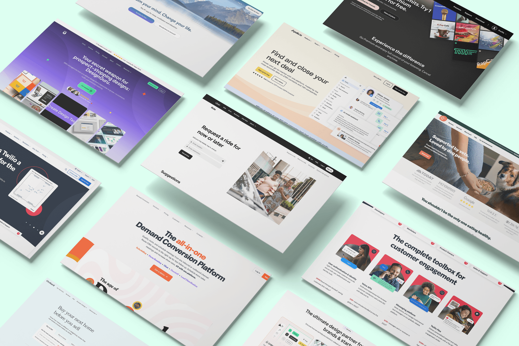
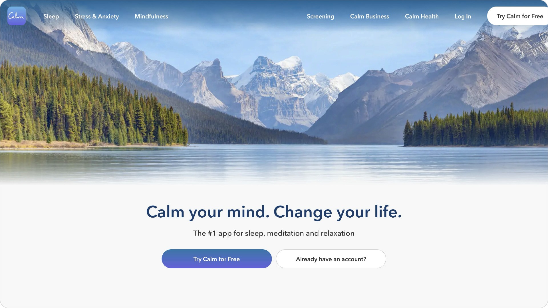
Calm’s landing page feels like a digital spa day for your eyeballs. With serene imagery and soothing copy, it invites visitors to unwind and engage with a standout CTA that encourages action.
Why it converts:
The calming visuals create an inviting atmosphere.
Clear messaging directs users to take action easily.
Apollo.io: Simplicity is the Ultimate Sophistication
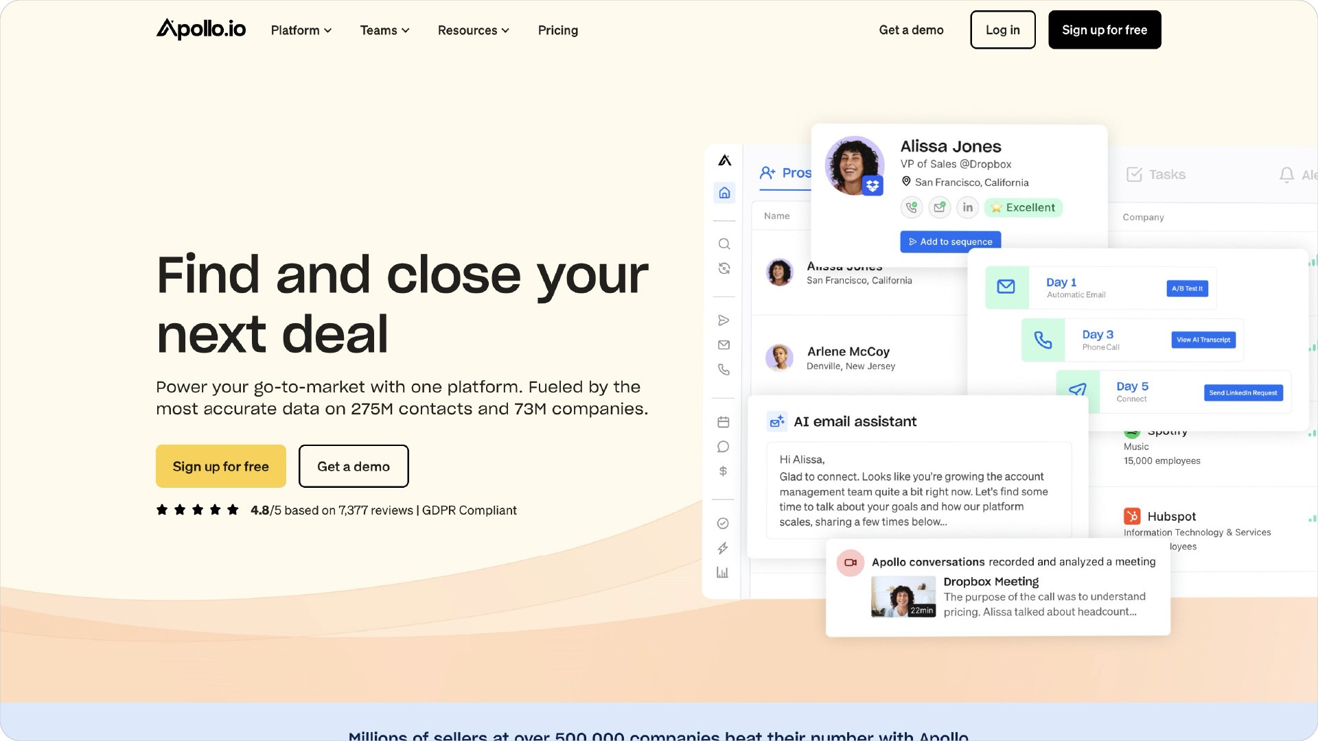
Apollo.io‘s landing page excels in clarity and simplicity. Its straightforward headline and easy-to-fill-out CTA help users find work emails effortlessly while showcasing ample social proof that builds trust.
Why it converts:
A clean design helps users focus on the main CTA.
Simple buttons make it easy for users to engage quickly.
DesignGuru: Where Great Design Meets Unlimited Potential
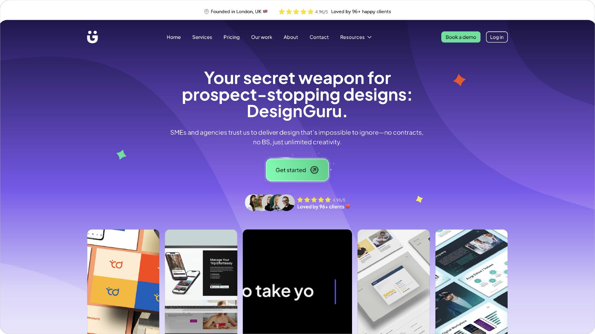
DesignGuru’s landing page serves as an all-you-can-eat buffet for design services. Featuring an eye-catching hero section and clearly laid out benefits, it effectively communicates our unique offerings with simple pricing structures and glowing testimonials that highlight our expertise.
Why it converts:
A compelling hero section captures attention immediately.
Clear benefits help users understand what they gain.
Spotify: A Visual Symphony
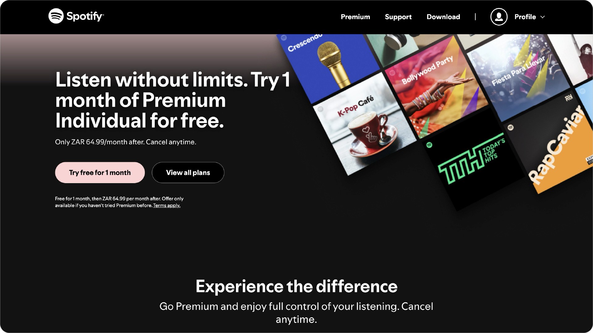
Spotify’s landing page is vibrant and engaging. Its bold design combined with compelling copy creates an irresistible offer that draws visitors in and encourages exploration.
Why it converts:
Bold visuals attract attention right away.
Engaging copy encourages users to explore further.
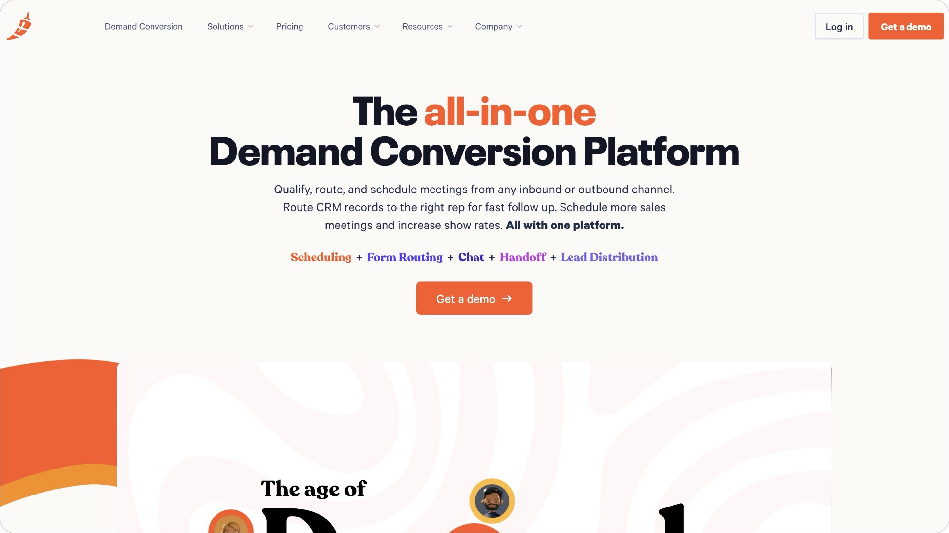
Chili Piper: Scheduling Made Spicy
Chili Piper’s Concierge page simplifies scheduling with a clear headline and personalised CTA that resonates with users while social proof displayed throughout helps build trust and encourages conversions.
Why it converts:
A straightforward headline communicates value instantly.
Personalisation helps users feel connected to the service.
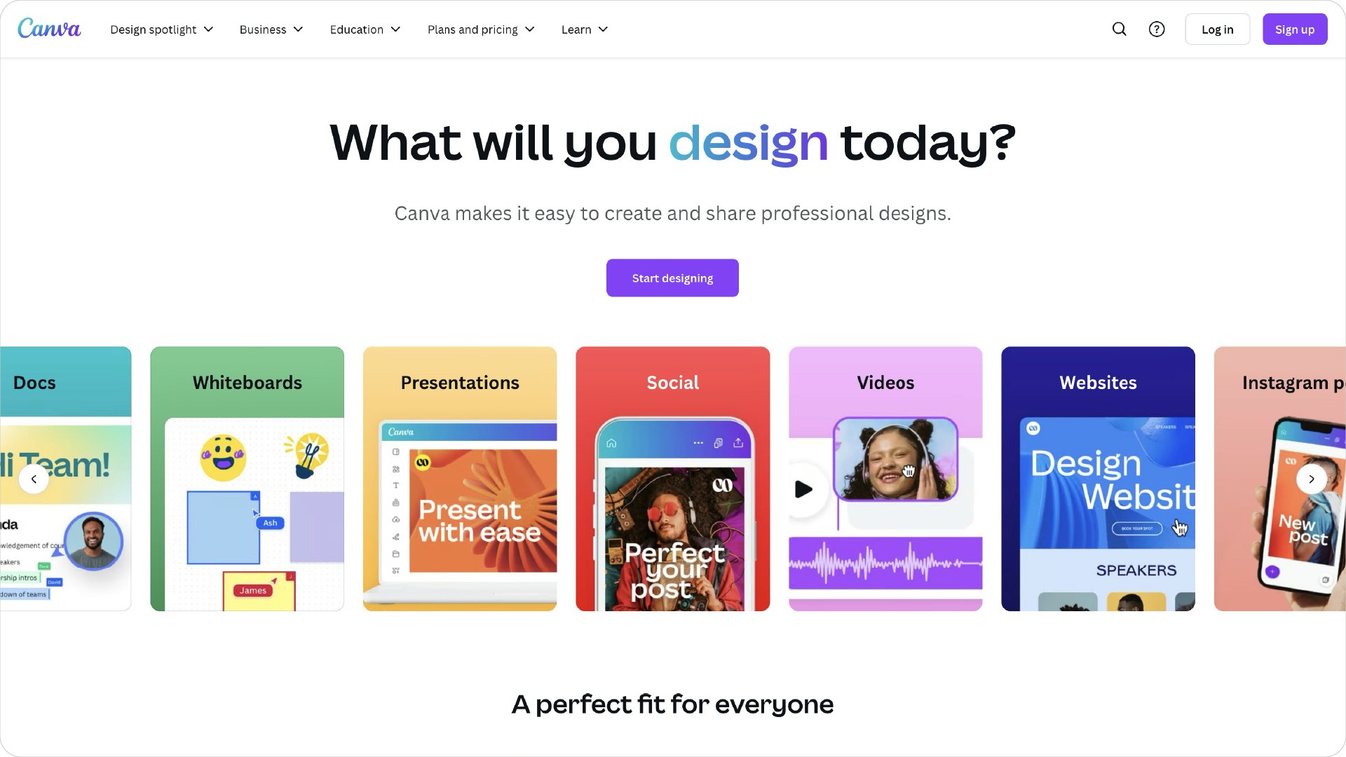
Canva: Creativity in a Can
Canva’s landing page energises users with its effective use of white space and informative video content that showcases its capabilities while making it easy for visitors to understand what they can achieve.
Why it converts:
Effective use of white space enhances readability.
Informative videos demonstrate product features clearly.
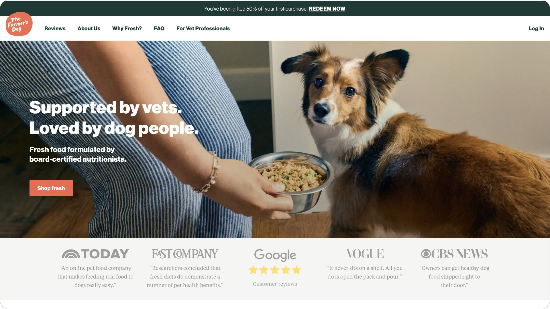
The Farmer's Dog: Puppy Love at First Site
The Farmer's Dog taps into emotional appeal with adorable imagery and relatable testimonials that resonate deeply with pet lovers, creating an inviting atmosphere that encourages engagement.
Why it converts:
Heartwarming images create an emotional connection.
Testimonials build trust among potential customers.
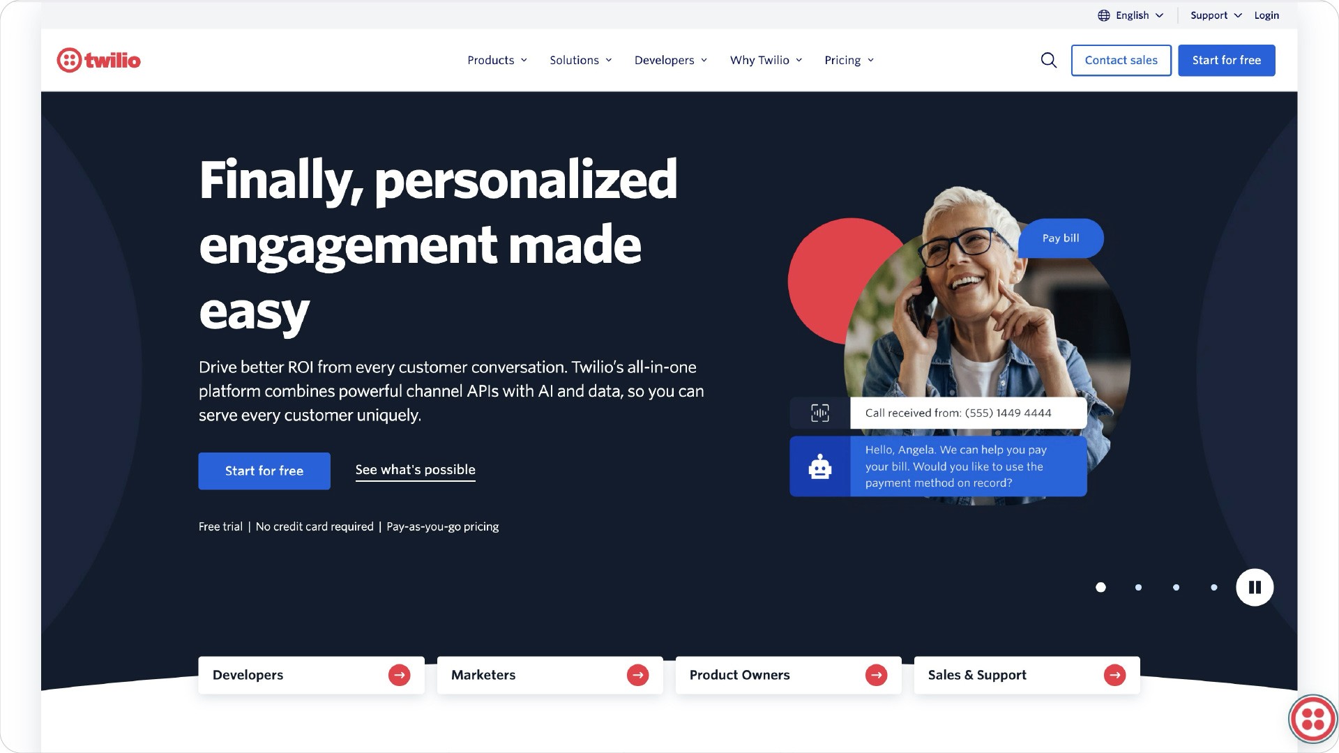
Twilio: Communication, But Make It Cloudy
Twilio’s landing page stands out with its clear messaging and informative video that effectively communicates its cloud communication services while guiding users toward action.
Why it converts:
Clear messaging makes the service easy to understand.
An informative video engages users effectively.
Orchard: Home Sweet Homepage
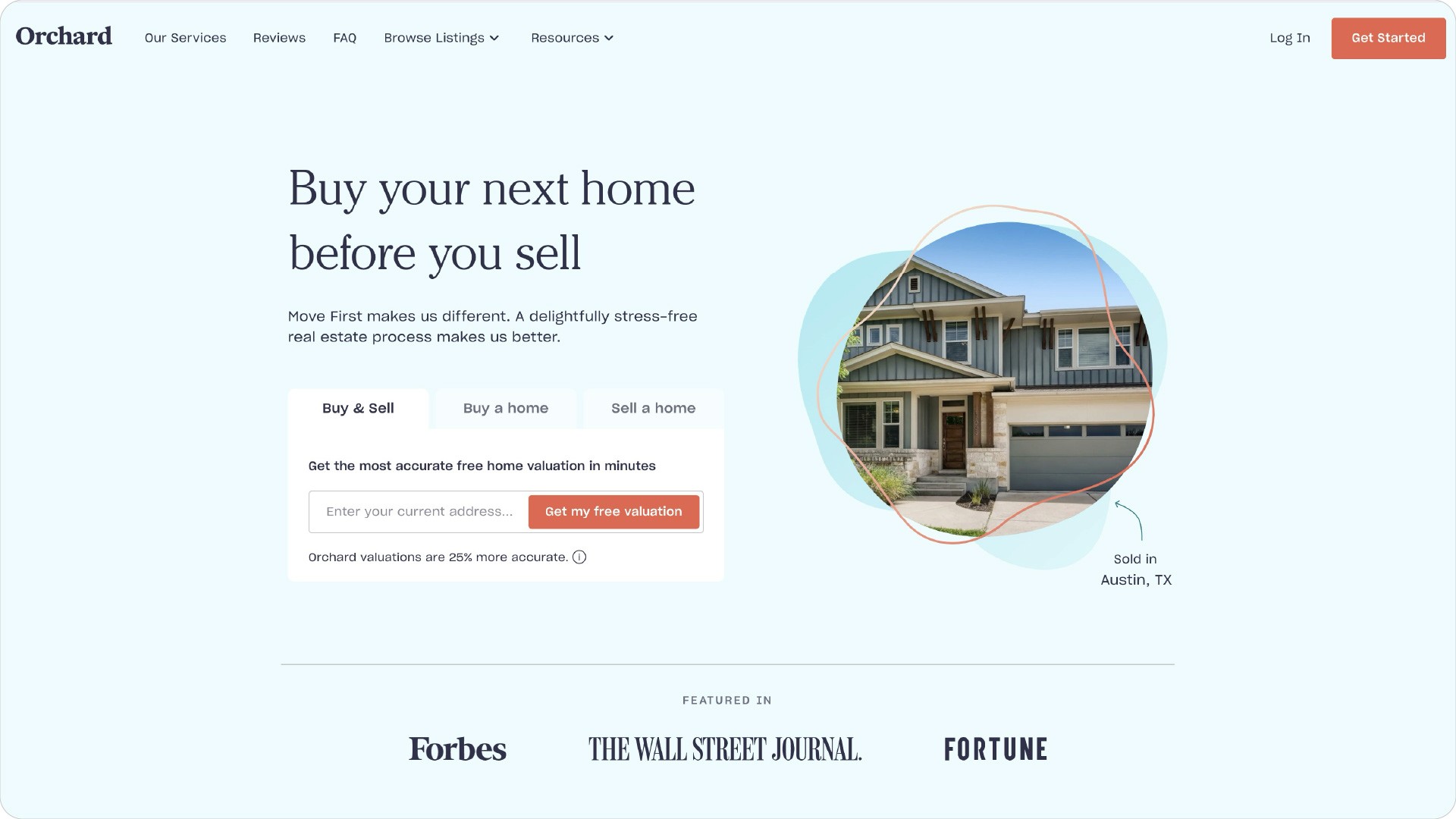
Orchard creates a cozy atmosphere with enticing CTAs and relatable testimonials that guide potential home buyers through the process of buying or selling homes without feeling overwhelmed.
Why it converts:
Enticing CTAs encourage immediate user action.
Relatable testimonials help build confidence in the service.
Uber: Riding in Style (Digitally)
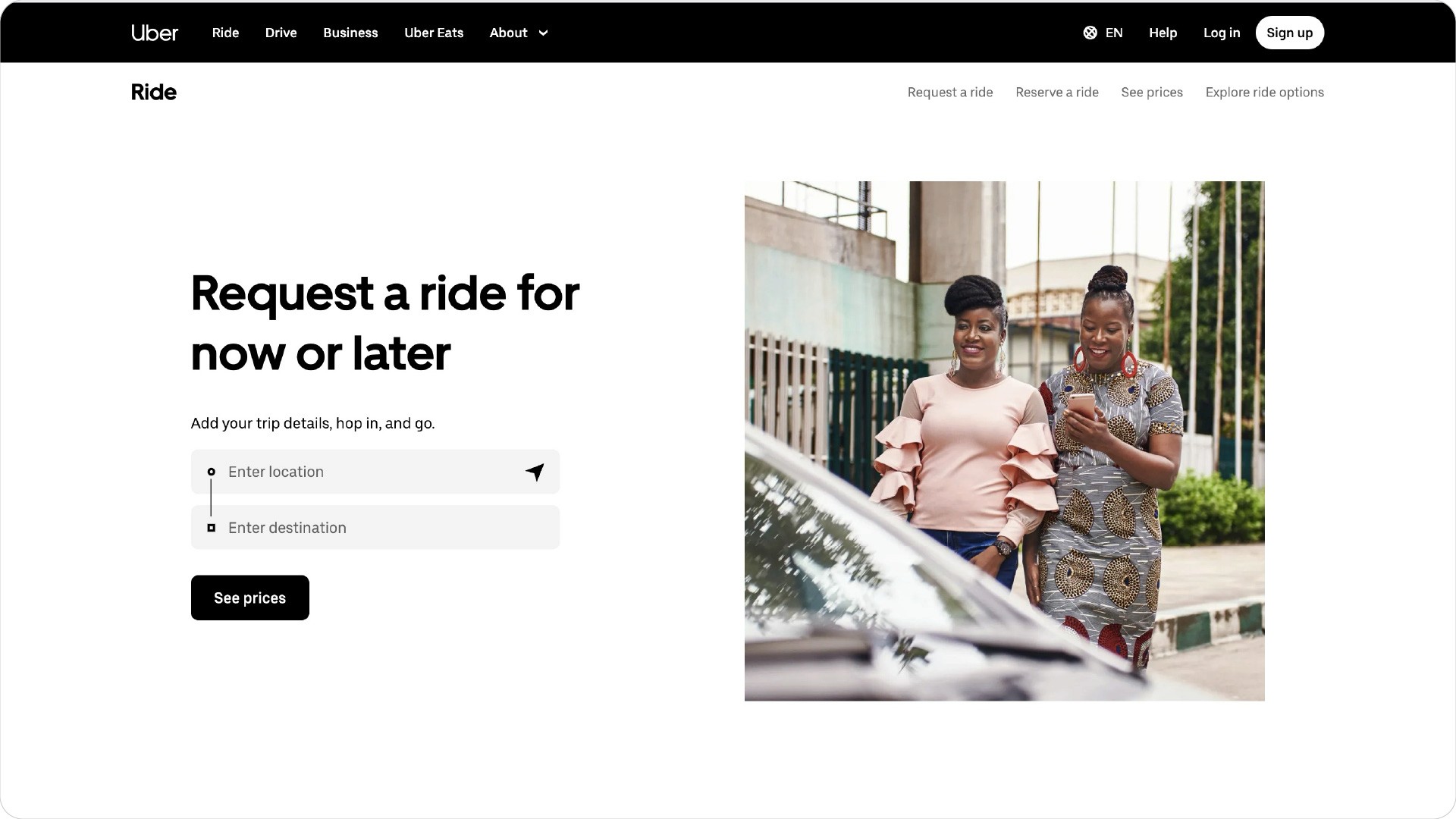
Uber’s sleek landing page uses striking design elements alongside clear messaging to capture attention while promoting its services effectively, making it easy for users to understand their options.
Why it converts:
Striking design elements draw users' attention quickly.
Clear messaging simplifies user navigation.
Landing Page Design Best Practices
Designing a landing page that converts requires a combination of art and science. Here are some best practices to keep in mind:
Keep it simple and focused: A landing page should have a single goal, and every element should be designed to support that goal. Avoid clutter and distractions to ensure your visitors can easily understand and act on your offer.
Use a clear and compelling headline: Your headline should grab the visitor’s attention and communicate the value of your offer. A strong landing page headline can make the difference between a bounce and a conversion.
Use high-quality visuals: Images and videos can help to break up the text and make your page more engaging. High-quality visuals not only attract attention but also help to convey your message more effectively. Looking for landing page inspiration can provide you with ideas and examples of successful designs to guide your own creation.
Make your CTA prominent: Your call-to-action (CTA) should be clear, prominent, and easy to find. Use contrasting colors and strategic placement to ensure it stands out on the entire page.
Use social proof: Testimonials, reviews, and trust badges can help to build trust with your visitors. Showcasing social proof can reassure potential customers that others have had positive experiences with your product or service.
Optimise for mobile: With more and more people accessing the web on their mobile devices, it’s essential to ensure that your landing page is optimised for mobile. A mobile-friendly design ensures a seamless experience for all users, regardless of the device they’re using.
Test and iterate: Using a landing page template can streamline the design process and ensure adherence to best practices. Testing different elements of your landing page can help you to identify what’s working and what’s not, and make data-driven decisions to improve your page’s performance. Regularly A/B testing your landing page elements can lead to continuous improvements and higher conversion rates.
By following these best practices, you can create landing pages that not only look great but also drive conversions. Remember, the key to an effective landing page is to keep it simple, focused, and user-centric.
Final Thoughts on Landing Pages
The best landing pages of 2024 aren’t just eye candy; they’re conversion machines with an acute understanding of user psychology, addressing pain points head-on with visuals sharper than any chef’s knife. Product landing pages play a crucial role in this, effectively conveying the value proposition through engaging design and concise information.
Feeling inspired but unsure where to start? That’s where DesignGuru comes in—we’re ready to create the perfect landing page that’ll have your conversions dancing all night long! Book a call with DesignGuru today and let’s turn your landing page from wallflower to wonder! Remember, optimising other landing pages on your site is equally important to maintain high conversion rates.
To maximise your success, consider creating your own landing page using the tips provided, focusing on minimalistic design, compelling visuals, and clear calls to action.
Your landing page is the digital equivalent of a red carpet—it attracts attention and rolls out the welcome mat for potential customers. In 2024, a well-crafted landing page isn’t just nice to have; it’s essential. After all, landing pages boast a jaw-dropping 160% higher conversion rate than traditional signup forms. Let’s explore the top 10 high converting landing pages that can elevate your site and transform casual browsers into eager buyers. By examining the best landing page examples, you can gain insights and inspiration to create your own successful landing pages. A well-chosen landing page example can showcase effective design and marketing strategies, helping you understand how to engage visitors and convey your brand's value proposition.
What is a Landing Page?
A landing page is a standalone web page designed with a single focus: to convert visitors into customers. Whether it’s offering a resource like an ebook or a webinar signup, the primary goal is to capture basic contact information and generate leads. In essence, a landing page acts as a gateway, pulling prospects further into the customer funnel and driving sales.
Effective landing pages are the backbone of successful online marketing strategies. They can significantly boost conversion rates and, ultimately, revenue. But what makes a good landing page? It all starts with a clear and compelling headline that grabs attention and communicates value instantly. Pair this with strong, relevant visuals that support your message, and you’re halfway there.
Concise and persuasive copy is another critical element. Your text should be straightforward, highlighting the benefits and addressing potential pain points. A strong call-to-action (CTA) is non-negotiable—make it prominent and easy to find. Trust signals, such as testimonials and reviews, can further reassure visitors and build credibility.
In today’s mobile-first world, ensuring your landing page is mobile-responsive is crucial. Fast loading speeds are also essential to keep visitors engaged. By incorporating these elements, you can create a successful landing page that not only attracts but also converts visitors.
User experience should be at the forefront of your design. This means clear and easy-to-use navigation, effective use of whitespace, and a scannable layout. Prioritising user experience increases the likelihood of turning visitors into loyal customers.
In summary, a landing page is a vital component of any online marketing strategy. By focusing on key elements like a compelling headline, strong visuals, persuasive copy, and a clear CTA, you can create effective landing pages that drive conversions and grow your customer base.
What Makes an Effective Landing Page?
Creating a good landing page that is high-converting is an art form. The secret? Focus. A landing page should guide landing page visitors toward a single, clear call to action (CTA). It’s all about eliminating distractions and honing in on what you want your visitors to do. To harness the full power of these pages, understanding their anatomy and best practices is essential—no medical degree required!
A strong call-to-action (CTA) is non-negotiable—make it prominent and easy to find. Additionally, optimising the landing page form by limiting fields can significantly enhance user experience and increase conversions.
Trust signals, such as testimonials and reviews, can further reassure visitors and build credibility. An interactive landing page can also enhance user engagement by incorporating dynamic elements that respond to viewer actions, revealing more information about the product or service.
Calm: Zen in Digital Form
Calm’s landing page feels like a digital spa day for your eyeballs. With serene imagery and soothing copy, it invites visitors to unwind and engage with a standout CTA that encourages action.
Why it converts:
The calming visuals create an inviting atmosphere.
Clear messaging directs users to take action easily.

Apollo.io: Simplicity is the Ultimate Sophistication
Apollo.io‘s landing page excels in clarity and simplicity. Its straightforward headline and easy-to-fill-out CTA help users find work emails effortlessly while showcasing ample social proof that builds trust.
Why it converts:
A clean design helps users focus on the main CTA.
Simple buttons make it easy for users to engage quickly.

DesignGuru: Where Great Design Meets Unlimited Potential
DesignGuru’s landing page serves as an all-you-can-eat buffet for design services. Featuring an eye-catching hero section and clearly laid out benefits, it effectively communicates our unique offerings with simple pricing structures and glowing testimonials that highlight our expertise.
Why it converts:
A compelling hero section captures attention immediately.
Clear benefits help users understand what they gain.

Spotify: A Visual Symphony
Spotify’s landing page is vibrant and engaging. Its bold design combined with compelling copy creates an irresistible offer that draws visitors in and encourages exploration.
Why it converts:
Bold visuals attract attention right away.
Engaging copy encourages users to explore further.

Chili Piper: Scheduling Made Spicy
Chili Piper’s Concierge page simplifies scheduling with a clear headline and personalised CTA that resonates with users while social proof displayed throughout helps build trust and encourages conversions.
Why it converts:
A straightforward headline communicates value instantly.
Personalisation helps users feel connected to the service.

Canva: Creativity in a Can
Canva’s landing page energises users with its effective use of white space and informative video content that showcases its capabilities while making it easy for visitors to understand what they can achieve.
Why it converts:
Effective use of white space enhances readability.
Informative videos demonstrate product features clearly.

The Farmer's Dog: Puppy Love at First Site
The Farmer's Dog taps into emotional appeal with adorable imagery and relatable testimonials that resonate deeply with pet lovers, creating an inviting atmosphere that encourages engagement.
Why it converts:
Heartwarming images create an emotional connection.
Testimonials build trust among potential customers.

Twilio: Communication, But Make It Cloudy
Twilio’s landing page stands out with its clear messaging and informative video that effectively communicates its cloud communication services while guiding users toward action.
Why it converts:
Clear messaging makes the service easy to understand.
An informative video engages users effectively.

Orchard: Home Sweet Homepage
Orchard creates a cozy atmosphere with enticing CTAs and relatable testimonials that guide potential home buyers through the process of buying or selling homes without feeling overwhelmed.
Why it converts:
Enticing CTAs encourage immediate user action.
Relatable testimonials help build confidence in the service.

Uber: Riding in Style (Digitally)
Uber’s sleek landing page uses striking design elements alongside clear messaging to capture attention while promoting its services effectively, making it easy for users to understand their options.
Why it converts:
Striking design elements draw users' attention quickly.
Clear messaging simplifies user navigation.

Landing Page Design Best Practices
Designing a landing page that converts requires a combination of art and science. Here are some best practices to keep in mind:
Keep it simple and focused: A landing page should have a single goal, and every element should be designed to support that goal. Avoid clutter and distractions to ensure your visitors can easily understand and act on your offer.
Use a clear and compelling headline: Your headline should grab the visitor’s attention and communicate the value of your offer. A strong landing page headline can make the difference between a bounce and a conversion.
Use high-quality visuals: Images and videos can help to break up the text and make your page more engaging. High-quality visuals not only attract attention but also help to convey your message more effectively. Looking for landing page inspiration can provide you with ideas and examples of successful designs to guide your own creation.
Make your CTA prominent: Your call-to-action (CTA) should be clear, prominent, and easy to find. Use contrasting colors and strategic placement to ensure it stands out on the entire page.
Use social proof: Testimonials, reviews, and trust badges can help to build trust with your visitors. Showcasing social proof can reassure potential customers that others have had positive experiences with your product or service.
Optimise for mobile: With more and more people accessing the web on their mobile devices, it’s essential to ensure that your landing page is optimised for mobile. A mobile-friendly design ensures a seamless experience for all users, regardless of the device they’re using.
Test and iterate: Using a landing page template can streamline the design process and ensure adherence to best practices. Testing different elements of your landing page can help you to identify what’s working and what’s not, and make data-driven decisions to improve your page’s performance. Regularly A/B testing your landing page elements can lead to continuous improvements and higher conversion rates.
By following these best practices, you can create landing pages that not only look great but also drive conversions. Remember, the key to an effective landing page is to keep it simple, focused, and user-centric.
Final Thoughts on Landing Pages
The best landing pages of 2024 aren’t just eye candy; they’re conversion machines with an acute understanding of user psychology, addressing pain points head-on with visuals sharper than any chef’s knife. Product landing pages play a crucial role in this, effectively conveying the value proposition through engaging design and concise information.
Feeling inspired but unsure where to start? That’s where DesignGuru comes in—we’re ready to create the perfect landing page that’ll have your conversions dancing all night long! Book a call with DesignGuru today and let’s turn your landing page from wallflower to wonder! Remember, optimising other landing pages on your site is equally important to maintain high conversion rates.
To maximise your success, consider creating your own landing page using the tips provided, focusing on minimalistic design, compelling visuals, and clear calls to action.
Your landing page is the digital equivalent of a red carpet—it attracts attention and rolls out the welcome mat for potential customers. In 2024, a well-crafted landing page isn’t just nice to have; it’s essential. After all, landing pages boast a jaw-dropping 160% higher conversion rate than traditional signup forms. Let’s explore the top 10 high converting landing pages that can elevate your site and transform casual browsers into eager buyers. By examining the best landing page examples, you can gain insights and inspiration to create your own successful landing pages. A well-chosen landing page example can showcase effective design and marketing strategies, helping you understand how to engage visitors and convey your brand's value proposition.
What is a Landing Page?
A landing page is a standalone web page designed with a single focus: to convert visitors into customers. Whether it’s offering a resource like an ebook or a webinar signup, the primary goal is to capture basic contact information and generate leads. In essence, a landing page acts as a gateway, pulling prospects further into the customer funnel and driving sales.
Effective landing pages are the backbone of successful online marketing strategies. They can significantly boost conversion rates and, ultimately, revenue. But what makes a good landing page? It all starts with a clear and compelling headline that grabs attention and communicates value instantly. Pair this with strong, relevant visuals that support your message, and you’re halfway there.
Concise and persuasive copy is another critical element. Your text should be straightforward, highlighting the benefits and addressing potential pain points. A strong call-to-action (CTA) is non-negotiable—make it prominent and easy to find. Trust signals, such as testimonials and reviews, can further reassure visitors and build credibility.
In today’s mobile-first world, ensuring your landing page is mobile-responsive is crucial. Fast loading speeds are also essential to keep visitors engaged. By incorporating these elements, you can create a successful landing page that not only attracts but also converts visitors.
User experience should be at the forefront of your design. This means clear and easy-to-use navigation, effective use of whitespace, and a scannable layout. Prioritising user experience increases the likelihood of turning visitors into loyal customers.
In summary, a landing page is a vital component of any online marketing strategy. By focusing on key elements like a compelling headline, strong visuals, persuasive copy, and a clear CTA, you can create effective landing pages that drive conversions and grow your customer base.
What Makes an Effective Landing Page?
Creating a good landing page that is high-converting is an art form. The secret? Focus. A landing page should guide landing page visitors toward a single, clear call to action (CTA). It’s all about eliminating distractions and honing in on what you want your visitors to do. To harness the full power of these pages, understanding their anatomy and best practices is essential—no medical degree required!
A strong call-to-action (CTA) is non-negotiable—make it prominent and easy to find. Additionally, optimising the landing page form by limiting fields can significantly enhance user experience and increase conversions.
Trust signals, such as testimonials and reviews, can further reassure visitors and build credibility. An interactive landing page can also enhance user engagement by incorporating dynamic elements that respond to viewer actions, revealing more information about the product or service.
Calm: Zen in Digital Form
Calm’s landing page feels like a digital spa day for your eyeballs. With serene imagery and soothing copy, it invites visitors to unwind and engage with a standout CTA that encourages action.
Why it converts:
The calming visuals create an inviting atmosphere.
Clear messaging directs users to take action easily.

Apollo.io: Simplicity is the Ultimate Sophistication
Apollo.io‘s landing page excels in clarity and simplicity. Its straightforward headline and easy-to-fill-out CTA help users find work emails effortlessly while showcasing ample social proof that builds trust.
Why it converts:
A clean design helps users focus on the main CTA.
Simple buttons make it easy for users to engage quickly.

DesignGuru: Where Great Design Meets Unlimited Potential
DesignGuru’s landing page serves as an all-you-can-eat buffet for design services. Featuring an eye-catching hero section and clearly laid out benefits, it effectively communicates our unique offerings with simple pricing structures and glowing testimonials that highlight our expertise.
Why it converts:
A compelling hero section captures attention immediately.
Clear benefits help users understand what they gain.

Spotify: A Visual Symphony
Spotify’s landing page is vibrant and engaging. Its bold design combined with compelling copy creates an irresistible offer that draws visitors in and encourages exploration.
Why it converts:
Bold visuals attract attention right away.
Engaging copy encourages users to explore further.

Chili Piper: Scheduling Made Spicy
Chili Piper’s Concierge page simplifies scheduling with a clear headline and personalised CTA that resonates with users while social proof displayed throughout helps build trust and encourages conversions.
Why it converts:
A straightforward headline communicates value instantly.
Personalisation helps users feel connected to the service.

Canva: Creativity in a Can
Canva’s landing page energises users with its effective use of white space and informative video content that showcases its capabilities while making it easy for visitors to understand what they can achieve.
Why it converts:
Effective use of white space enhances readability.
Informative videos demonstrate product features clearly.

The Farmer's Dog: Puppy Love at First Site
The Farmer's Dog taps into emotional appeal with adorable imagery and relatable testimonials that resonate deeply with pet lovers, creating an inviting atmosphere that encourages engagement.
Why it converts:
Heartwarming images create an emotional connection.
Testimonials build trust among potential customers.

Twilio: Communication, But Make It Cloudy
Twilio’s landing page stands out with its clear messaging and informative video that effectively communicates its cloud communication services while guiding users toward action.
Why it converts:
Clear messaging makes the service easy to understand.
An informative video engages users effectively.

Orchard: Home Sweet Homepage
Orchard creates a cozy atmosphere with enticing CTAs and relatable testimonials that guide potential home buyers through the process of buying or selling homes without feeling overwhelmed.
Why it converts:
Enticing CTAs encourage immediate user action.
Relatable testimonials help build confidence in the service.

Uber: Riding in Style (Digitally)
Uber’s sleek landing page uses striking design elements alongside clear messaging to capture attention while promoting its services effectively, making it easy for users to understand their options.
Why it converts:
Striking design elements draw users' attention quickly.
Clear messaging simplifies user navigation.

Landing Page Design Best Practices
Designing a landing page that converts requires a combination of art and science. Here are some best practices to keep in mind:
Keep it simple and focused: A landing page should have a single goal, and every element should be designed to support that goal. Avoid clutter and distractions to ensure your visitors can easily understand and act on your offer.
Use a clear and compelling headline: Your headline should grab the visitor’s attention and communicate the value of your offer. A strong landing page headline can make the difference between a bounce and a conversion.
Use high-quality visuals: Images and videos can help to break up the text and make your page more engaging. High-quality visuals not only attract attention but also help to convey your message more effectively. Looking for landing page inspiration can provide you with ideas and examples of successful designs to guide your own creation.
Make your CTA prominent: Your call-to-action (CTA) should be clear, prominent, and easy to find. Use contrasting colors and strategic placement to ensure it stands out on the entire page.
Use social proof: Testimonials, reviews, and trust badges can help to build trust with your visitors. Showcasing social proof can reassure potential customers that others have had positive experiences with your product or service.
Optimise for mobile: With more and more people accessing the web on their mobile devices, it’s essential to ensure that your landing page is optimised for mobile. A mobile-friendly design ensures a seamless experience for all users, regardless of the device they’re using.
Test and iterate: Using a landing page template can streamline the design process and ensure adherence to best practices. Testing different elements of your landing page can help you to identify what’s working and what’s not, and make data-driven decisions to improve your page’s performance. Regularly A/B testing your landing page elements can lead to continuous improvements and higher conversion rates.
By following these best practices, you can create landing pages that not only look great but also drive conversions. Remember, the key to an effective landing page is to keep it simple, focused, and user-centric.
Final Thoughts on Landing Pages
The best landing pages of 2024 aren’t just eye candy; they’re conversion machines with an acute understanding of user psychology, addressing pain points head-on with visuals sharper than any chef’s knife. Product landing pages play a crucial role in this, effectively conveying the value proposition through engaging design and concise information.
Feeling inspired but unsure where to start? That’s where DesignGuru comes in—we’re ready to create the perfect landing page that’ll have your conversions dancing all night long! Book a call with DesignGuru today and let’s turn your landing page from wallflower to wonder! Remember, optimising other landing pages on your site is equally important to maintain high conversion rates.
To maximise your success, consider creating your own landing page using the tips provided, focusing on minimalistic design, compelling visuals, and clear calls to action.
Related blogs
Related blogs

Ready to supercharge your business?
See why 96+ happy customers love working with us!

Flexible subscription

No contracts
Branding
Ad Design & Creative
Presentations
Illustrations
UX & UI Design
Video & Animation
Print Design

Ready to supercharge your business?
See why 96+ happy customers love working with us!

Flexible subscription

No contracts
Branding
Ad Design & Creative
Presentations
Illustrations
UX & UI Design
Video & Animation
Print Design

Ready to supercharge your business?
See why 96+ happy customers love working with us!

Flexible subscription

No contracts
Branding
Ad Design & Creative
Presentations
Illustrations
UX & UI Design
Video & Animation
Print Design

