
Your Black Friday ad is competing with thousands of others in the busiest shopping season of the year. It’s crucial to make it count. Managing your ad budget effectively is essential to ensure you have the financial resources needed for high-demand periods.
When creating your Black Friday campaign, it’s easy to fall into the trap of using the same old red discount stamps and ‘MEGA SALE’ headlines everyone else is using. But in a sea of sameness, being different is your biggest advantage.
We’ve seen countless generic Black Friday ads - overwhelming red and black colour schemes, overused starbursts, and shouty discount messaging. And it still surprises us how many brands miss the opportunity to stand out.
Your Black Friday ad should capture attention and drive action while staying true to your brand. You need to make it memorable and make it convert.
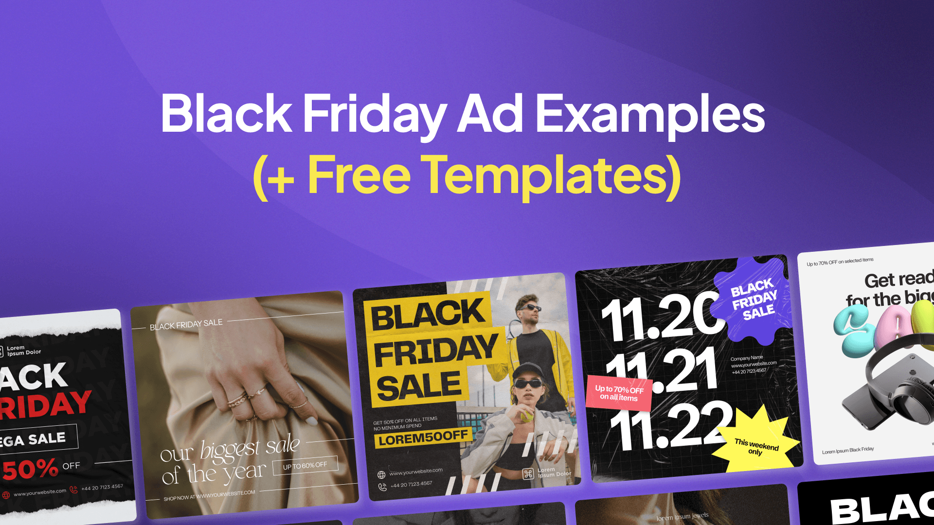
We know designing your Black Friday campaign can feel daunting, especially when you’re racing against time. So, we’ve curated the best Black Friday ad examples to inspire you, plus we’re including free templates you can use right away.
Why Run Black Friday Ads?
Running Black Friday ads is a strategic move that goes beyond just capitalising on sales spikes. With billions of dollars spent during the Black Friday weekend, it’s essential to stand out in all aspects of your brand. Facebook ads provide a powerful platform to ensure your Black Friday offers reach an audience primed to spend. By running Facebook ads during Black Friday, you can increase brand awareness, drive website traffic, and boost sales.
Facebook ads allow you to target specific demographics, interests, and behaviors, ensuring your Black Friday promotions reach the right people. This targeted approach not only maximizes your ad spend but also enhances the chances of converting viewers into customers. Additionally, the platform’s robust analytics tools help you track performance and optimise your campaigns in real-time.
Key Takeaway: Leveraging Facebook ads during Black Friday can significantly amplify your reach and impact, driving both immediate sales and long-term brand growth.
What Makes a Great Black Friday Ad?
Before we look at the examples, let’s quickly cover what makes a Black Friday ad effective:
Clear Value Proposition: Your offer should be immediately obvious
Brand Consistency: Even during sales, maintain your brand identity
Clean Design: Avoid cluttering the ad with too many elements
Urgency: Create FOMO without being aggressive
Call-to-Action: Make the next step crystal clear
Ad Creative: Capture audience attention and drive engagement with simple yet compelling designs that align with your brand identity
Set Clear Goals
Before diving into your Black Friday Facebook ad campaign, it’s crucial to set clear goals. Determine what you want to achieve, whether it’s increasing revenue, gaining new email subscribers, or reaching new potential customers. Establish key performance indicators (KPIs) to track, such as click-through rates (CTR), conversion rates, and cost per acquisition (CPA).
Having clear goals will help you focus your ad campaign and measure its success. For instance, if your goal is to increase revenue, you might prioritise high-converting ad creatives and allocate more budget towards top-performing ads. If your aim is to grow your email list, you might focus on lead generation ads with compelling offers.
Key Takeaway: Clear goals and KPIs provide direction and measurable benchmarks for your Black Friday Facebook ad campaign, ensuring you stay on track and achieve desired outcomes.
Know Your Target Customer
Understanding your target audience is the foundation of a successful ad campaign. Identify key demographics, interests, and online shopping habits of your ideal customers. Recognise their pain points and how your Black Friday offers can solve them. Use this information to create targeted ad creatives that resonate with your audience.
For example, if your target customers are tech enthusiasts, highlight the latest gadgets and exclusive deals in your ads. If they are fashion-forward individuals, showcase trendy apparel and accessories. Tailoring your ad campaign to your audience’s preferences increases the likelihood of engagement and conversions.
Key Takeaway: Deep knowledge of your target customer allows you to craft ad creatives that speak directly to their needs and interests, enhancing the effectiveness of your Black Friday campaign.
Black Friday Ad Examples That Got It Right
1. LiberLive - Making Music Accessible
This audio equipment brand shows how to create an elegant Black Friday campaign that maintains brand sophistication:
What makes this ad brilliant:
Clean, minimalist design that lets the product shine
Creative headline “Unlock the Biggest Deal” ties perfectly with their product
Clear value add with “+ FREE Gifts with Your Buy!”
Emphasizing a Black Friday deal can attract consumers by clearly communicating pricing, discounts, and the specific timing of the event.
Strong CTA button that stands out
Perfect balance of white space and product imagery
Key Takeaway: You don’t need flashy designs to make an impact. Sometimes, letting your product be the hero while maintaining elegant simplicity works best.

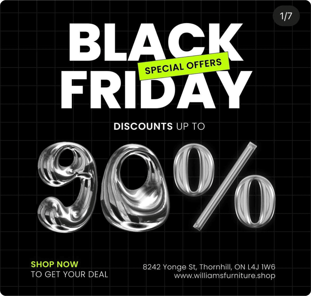
2. Williams Furniture - Bold Typography
This ad masterfully demonstrates how to use typography as a design element:
Dramatic “90%” grabs attention immediately
Promoting various Black Friday deals can engage customers and drive traffic
High contrast black background makes the message pop
Clean, modern typography creates visual interest
Address included for local targeting
“SHOP NOW” creates clear direction
Key Takeaway: Sometimes, the numbers can be your design. When you have a strong offer, let it take centre stage.
3. Reason Studios - Breaking Convention
Reason Studios breaks away from traditional Black Friday aesthetics:
Unique “40% OFF REASON” wordplay
Distinctive neon yellow accent colour
Clean, tech-focused design matching their brand
Clear discount code prominently displayed
Professional yet edgy vibe
Tailored promotions during Black Friday sales, like Glossier's 'Pink Friday' and Apple's gift card strategy, can significantly enhance visibility and sales.
Key Takeaway: Your Black Friday ad can (and should) reflect your brand personality, even during sale season.

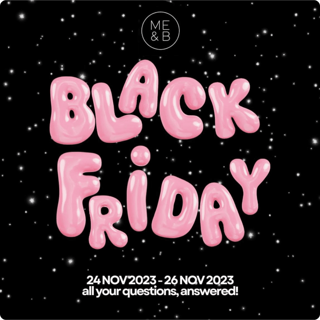
4. Me & B - Playful Approach
This ad shows how to keep your brand personality during sales:
Playful bubble letter typography
Starry night background adds whimsy
Clear date range displayed
Promise of “all your questions, answered!”
Consumers often do not need to read the entire ad to be motivated to engage, so focus on concise messaging and visual elements.
Brand colours maintained even in a sale ad
Key Takeaway: Don’t be afraid to inject personality into your Black Friday campaigns.
5. Kiehl's - Premium Positioning
Kiehl's maintains their premium positioning while promoting their sale:
Elegant product arrangement
Traditional holiday elements (ribbon, gift packaging)
Clear "50% OFF" messaging
Multiple product showcase
Maintains luxury feel despite the discount
Key Takeaway: High-end brands can do sales while maintaining their premium positioning.

6. Book Beau - Product Focus
Book Beau's approach shows how to create a welcoming sale atmosphere:
Lifestyle product photography creates context
Clear sale end date creates urgency
Multiple product showcases
Clean, easy-to-read design
Strong "Up to 60% off" messaging
Key Takeaway: Showing products in use can help customers envision their purchase.

7. TITAN Fitness - Bold and Direct
TITAN Fitness nails their Black Friday messaging:
Dramatic "BIGGEST SALE OF THE YEAR" headline
High-impact imagery
Clean, professional aesthetic
Clear "GOING ON NOW" urgency
Strong brand presence
Key Takeaway: Sometimes, direct and bold is the way to go.

8. Shopify - Modern Minimalism
Shopify's ad demonstrates contemporary design principles:
Playful visual elements
Clear countdown messaging
Clean typography
Engaging colour palette
Simple yet effective layout
Key Takeaway: Modern, minimalist design can create strong impact.

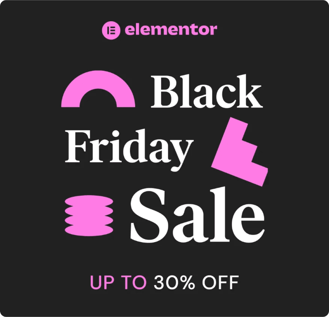
9. Elementor - Tech-Savvy Style
Elementor's approach shows how to target tech-savvy audiences:
Modern, clean design
Clear "UP TO 30% OFF" messaging
Brand-consistent colours
Simple yet effective layout
Professional tech aesthetic
Key Takeaway: Align your design with your audience's expectations.
10. Ray-Ban - Classic Cool
Ray-Ban maintains their iconic status while promoting their sale:
Classic product photography
Clear pricing display
Strong brand presence
Simple "50% OFF" message
Premium positioning maintained
Key Takeaway: Classic brands can maintain their cool factor during sales.

Design Tips for Effective Black Friday Ad Creatives
Keep Your Brand Identity
Don’t abandon your brand colours for traditional black and red
Maintain your usual typography and design elements
Let your brand personality shine through
Focus on Clarity
Make your offer immediately clear
Use hierarchy to guide the eye
Include only essential information
Utilise video ads to deliver a clear and concise message quickly to capture viewers' attention
Create Urgency Without Desperation
Use time-limited offers strategically
Highlight exclusivity when possible
Avoid desperate-sounding language
Mobile-First Design
Ensure text is readable on small screens
Make CTAs thumb-friendly
Test your design across devices
Stand Out From the Crowd
Avoid overused Black Friday design clichés
Try unexpected colour combinations
Use creative copywriting
Avoiding Common Mistakes
Even with a well-crafted strategy, certain pitfalls can undermine the effectiveness of your Black Friday Facebook ad campaign. Avoid budget burnout before the big day by allocating your ad spend wisely. Spread your budget across the entire Black Friday weekend to maintain momentum and avoid running out of funds too early.
Don’t focus solely on promotions and discounts, as this can lead to a lack of brand messaging and value proposition. Ensure your ads communicate the unique value of your products or services, not just the price cuts. Also, avoid an overly aggressive approach early on, as this can lead to audience fatigue. Instead, build anticipation gradually and peak your efforts during the key shopping days.
Key Takeaway: By avoiding common mistakes such as budget mismanagement, overemphasis on discounts, and early aggression, you can create a balanced and effective Black Friday ad campaign that drives sales and engagement.
By following these guidelines, you can create Black Friday ads that not only stand out but also deliver impressive results.
Ready-to-Use Black Friday Templates
Standing out during Black Friday shouldn’t mean starting from scratch. DesignGuru’s template pack helps create distinctive campaigns efficiently. Utilising paid ads to promote Black Friday deals across various marketing channels can significantly enhance the reach and effectiveness of these campaigns.
What's Inside
40+ Proven Ad Examples for inspiration
12 Ready-to-Use Templates for quick customisation
Modern, Clean Designs tested for conversion
Time-Saving Formats for busy seasons
Perfect for marketing teams, business owners, and designers who need professional Black Friday ads without the typical clichés.
→ Get Your Black Friday Templates Here
Need design support for your Black Friday campaign?
Need help creating your Black Friday campaign? Our unlimited design subscription can help you stand out this holiday season. Utilising an ads manager is crucial for tracking performance metrics and making data-driven adjustments to enhance campaign effectiveness. Book a call to learn more.
Explore DesignGuru
View Our Portfolio - See how we've helped other brands stand out
How It Works - Learn about our design process
Pricing Plans - Explore our unlimited design subscription options
Final Thoughts
Black Friday presents a unique opportunity to showcase creative excellence even during peak promotional periods. The strongest campaigns demonstrate that sales messaging can coexist with sophisticated design, proving that effective doesn’t mean ordinary.
The best Black Friday ads accomplish multiple goals:
They announce compelling offers without shouting
They maintain brand integrity while driving urgency
They stand out by design, not just by discount
They build long-term brand value beyond the sale
Success in Black Friday advertising isn’t measured solely by conversion rates. It’s about creating campaigns that resonate with your audience, reflect your brand values, and set you apart from the sea of generic sale messaging. Targeting previous website visitors and increasing website traffic are key objectives in achieving overall marketing success.
Remember, your next Black Friday campaign could be the one that transforms how your audience sees your brand. Make it count.
Your Black Friday ad is competing with thousands of others in the busiest shopping season of the year. It’s crucial to make it count. Managing your ad budget effectively is essential to ensure you have the financial resources needed for high-demand periods.
When creating your Black Friday campaign, it’s easy to fall into the trap of using the same old red discount stamps and ‘MEGA SALE’ headlines everyone else is using. But in a sea of sameness, being different is your biggest advantage.
We’ve seen countless generic Black Friday ads - overwhelming red and black colour schemes, overused starbursts, and shouty discount messaging. And it still surprises us how many brands miss the opportunity to stand out.
Your Black Friday ad should capture attention and drive action while staying true to your brand. You need to make it memorable and make it convert.
We know designing your Black Friday campaign can feel daunting, especially when you’re racing against time. So, we’ve curated the best Black Friday ad examples to inspire you, plus we’re including free templates you can use right away.
Why Run Black Friday Ads?
Running Black Friday ads is a strategic move that goes beyond just capitalising on sales spikes. With billions of dollars spent during the Black Friday weekend, it’s essential to stand out in all aspects of your brand. Facebook ads provide a powerful platform to ensure your Black Friday offers reach an audience primed to spend. By running Facebook ads during Black Friday, you can increase brand awareness, drive website traffic, and boost sales.
Facebook ads allow you to target specific demographics, interests, and behaviors, ensuring your Black Friday promotions reach the right people. This targeted approach not only maximizes your ad spend but also enhances the chances of converting viewers into customers. Additionally, the platform’s robust analytics tools help you track performance and optimise your campaigns in real-time.
Key Takeaway: Leveraging Facebook ads during Black Friday can significantly amplify your reach and impact, driving both immediate sales and long-term brand growth.
What Makes a Great Black Friday Ad?
Before we look at the examples, let’s quickly cover what makes a Black Friday ad effective:
Clear Value Proposition: Your offer should be immediately obvious
Brand Consistency: Even during sales, maintain your brand identity
Clean Design: Avoid cluttering the ad with too many elements
Urgency: Create FOMO without being aggressive
Call-to-Action: Make the next step crystal clear
Ad Creative: Capture audience attention and drive engagement with simple yet compelling designs that align with your brand identity
Set Clear Goals
Before diving into your Black Friday Facebook ad campaign, it’s crucial to set clear goals. Determine what you want to achieve, whether it’s increasing revenue, gaining new email subscribers, or reaching new potential customers. Establish key performance indicators (KPIs) to track, such as click-through rates (CTR), conversion rates, and cost per acquisition (CPA).
Having clear goals will help you focus your ad campaign and measure its success. For instance, if your goal is to increase revenue, you might prioritise high-converting ad creatives and allocate more budget towards top-performing ads. If your aim is to grow your email list, you might focus on lead generation ads with compelling offers.
Key Takeaway: Clear goals and KPIs provide direction and measurable benchmarks for your Black Friday Facebook ad campaign, ensuring you stay on track and achieve desired outcomes.
Know Your Target Customer
Understanding your target audience is the foundation of a successful ad campaign. Identify key demographics, interests, and online shopping habits of your ideal customers. Recognise their pain points and how your Black Friday offers can solve them. Use this information to create targeted ad creatives that resonate with your audience.
For example, if your target customers are tech enthusiasts, highlight the latest gadgets and exclusive deals in your ads. If they are fashion-forward individuals, showcase trendy apparel and accessories. Tailoring your ad campaign to your audience’s preferences increases the likelihood of engagement and conversions.
Key Takeaway: Deep knowledge of your target customer allows you to craft ad creatives that speak directly to their needs and interests, enhancing the effectiveness of your Black Friday campaign.
Black Friday Ad Examples That Got It Right
1. LiberLive - Making Music Accessible
This audio equipment brand shows how to create an elegant Black Friday campaign that maintains brand sophistication:
What makes this ad brilliant:
Clean, minimalist design that lets the product shine
Creative headline “Unlock the Biggest Deal” ties perfectly with their product
Clear value add with “+ FREE Gifts with Your Buy!”
Emphasizing a Black Friday deal can attract consumers by clearly communicating pricing, discounts, and the specific timing of the event.
Strong CTA button that stands out
Perfect balance of white space and product imagery
Key Takeaway: You don’t need flashy designs to make an impact. Sometimes, letting your product be the hero while maintaining elegant simplicity works best.

2. Williams Furniture - Bold Typography
This ad masterfully demonstrates how to use typography as a design element:
Dramatic “90%” grabs attention immediately
Promoting various Black Friday deals can engage customers and drive traffic
High contrast black background makes the message pop
Clean, modern typography creates visual interest
Address included for local targeting
“SHOP NOW” creates clear direction
Key Takeaway: Sometimes, the numbers can be your design. When you have a strong offer, let it take centre stage.

3. Reason Studios - Breaking Convention
Reason Studios breaks away from traditional Black Friday aesthetics:
Unique “40% OFF REASON” wordplay
Distinctive neon yellow accent colour
Clean, tech-focused design matching their brand
Clear discount code prominently displayed
Professional yet edgy vibe
Tailored promotions during Black Friday sales, like Glossier's 'Pink Friday' and Apple's gift card strategy, can significantly enhance visibility and sales.
Key Takeaway: Your Black Friday ad can (and should) reflect your brand personality, even during sale season.

4. Me & B - Playful Approach
This ad shows how to keep your brand personality during sales:
Playful bubble letter typography
Starry night background adds whimsy
Clear date range displayed
Promise of “all your questions, answered!”
Consumers often do not need to read the entire ad to be motivated to engage, so focus on concise messaging and visual elements.
Brand colours maintained even in a sale ad
Key Takeaway: Don’t be afraid to inject personality into your Black Friday campaigns.

5. Kiehl's - Premium Positioning
Kiehl's maintains their premium positioning while promoting their sale:
Elegant product arrangement
Traditional holiday elements (ribbon, gift packaging)
Clear "50% OFF" messaging
Multiple product showcase
Maintains luxury feel despite the discount
Key Takeaway: High-end brands can do sales while maintaining their premium positioning.

6. Book Beau - Product Focus
Book Beau's approach shows how to create a welcoming sale atmosphere:
Lifestyle product photography creates context
Clear sale end date creates urgency
Multiple product showcases
Clean, easy-to-read design
Strong "Up to 60% off" messaging
Key Takeaway: Showing products in use can help customers envision their purchase.

7. TITAN Fitness - Bold and Direct
TITAN Fitness nails their Black Friday messaging:
Dramatic "BIGGEST SALE OF THE YEAR" headline
High-impact imagery
Clean, professional aesthetic
Clear "GOING ON NOW" urgency
Strong brand presence
Key Takeaway: Sometimes, direct and bold is the way to go.

8. Shopify - Modern Minimalism
Shopify's ad demonstrates contemporary design principles:
Playful visual elements
Clear countdown messaging
Clean typography
Engaging colour palette
Simple yet effective layout
Key Takeaway: Modern, minimalist design can create strong impact.

9. Elementor - Tech-Savvy Style
Elementor's approach shows how to target tech-savvy audiences:
Modern, clean design
Clear "UP TO 30% OFF" messaging
Brand-consistent colours
Simple yet effective layout
Professional tech aesthetic
Key Takeaway: Align your design with your audience's expectations.

10. Ray-Ban - Classic Cool
Ray-Ban maintains their iconic status while promoting their sale:
Classic product photography
Clear pricing display
Strong brand presence
Simple "50% OFF" message
Premium positioning maintained
Key Takeaway: Classic brands can maintain their cool factor during sales.

Design Tips for Effective Black Friday Ad Creatives
Keep Your Brand Identity
Don’t abandon your brand colours for traditional black and red
Maintain your usual typography and design elements
Let your brand personality shine through
Focus on Clarity
Make your offer immediately clear
Use hierarchy to guide the eye
Include only essential information
Utilise video ads to deliver a clear and concise message quickly to capture viewers' attention
Create Urgency Without Desperation
Use time-limited offers strategically
Highlight exclusivity when possible
Avoid desperate-sounding language
Mobile-First Design
Ensure text is readable on small screens
Make CTAs thumb-friendly
Test your design across devices
Stand Out From the Crowd
Avoid overused Black Friday design clichés
Try unexpected colour combinations
Use creative copywriting
Avoiding Common Mistakes
Even with a well-crafted strategy, certain pitfalls can undermine the effectiveness of your Black Friday Facebook ad campaign. Avoid budget burnout before the big day by allocating your ad spend wisely. Spread your budget across the entire Black Friday weekend to maintain momentum and avoid running out of funds too early.
Don’t focus solely on promotions and discounts, as this can lead to a lack of brand messaging and value proposition. Ensure your ads communicate the unique value of your products or services, not just the price cuts. Also, avoid an overly aggressive approach early on, as this can lead to audience fatigue. Instead, build anticipation gradually and peak your efforts during the key shopping days.
Key Takeaway: By avoiding common mistakes such as budget mismanagement, overemphasis on discounts, and early aggression, you can create a balanced and effective Black Friday ad campaign that drives sales and engagement.
By following these guidelines, you can create Black Friday ads that not only stand out but also deliver impressive results.
Ready-to-Use Black Friday Templates
Standing out during Black Friday shouldn’t mean starting from scratch. DesignGuru’s template pack helps create distinctive campaigns efficiently. Utilising paid ads to promote Black Friday deals across various marketing channels can significantly enhance the reach and effectiveness of these campaigns.
What's Inside
40+ Proven Ad Examples for inspiration
12 Ready-to-Use Templates for quick customisation
Modern, Clean Designs tested for conversion
Time-Saving Formats for busy seasons
Perfect for marketing teams, business owners, and designers who need professional Black Friday ads without the typical clichés.
→ Get Your Black Friday Templates Here
Need design support for your Black Friday campaign?
Need help creating your Black Friday campaign? Our unlimited design subscription can help you stand out this holiday season. Utilising an ads manager is crucial for tracking performance metrics and making data-driven adjustments to enhance campaign effectiveness. Book a call to learn more.
Explore DesignGuru
View Our Portfolio - See how we've helped other brands stand out
How It Works - Learn about our design process
Pricing Plans - Explore our unlimited design subscription options
Final Thoughts
Black Friday presents a unique opportunity to showcase creative excellence even during peak promotional periods. The strongest campaigns demonstrate that sales messaging can coexist with sophisticated design, proving that effective doesn’t mean ordinary.
The best Black Friday ads accomplish multiple goals:
They announce compelling offers without shouting
They maintain brand integrity while driving urgency
They stand out by design, not just by discount
They build long-term brand value beyond the sale
Success in Black Friday advertising isn’t measured solely by conversion rates. It’s about creating campaigns that resonate with your audience, reflect your brand values, and set you apart from the sea of generic sale messaging. Targeting previous website visitors and increasing website traffic are key objectives in achieving overall marketing success.
Remember, your next Black Friday campaign could be the one that transforms how your audience sees your brand. Make it count.
Your Black Friday ad is competing with thousands of others in the busiest shopping season of the year. It’s crucial to make it count. Managing your ad budget effectively is essential to ensure you have the financial resources needed for high-demand periods.
When creating your Black Friday campaign, it’s easy to fall into the trap of using the same old red discount stamps and ‘MEGA SALE’ headlines everyone else is using. But in a sea of sameness, being different is your biggest advantage.
We’ve seen countless generic Black Friday ads - overwhelming red and black colour schemes, overused starbursts, and shouty discount messaging. And it still surprises us how many brands miss the opportunity to stand out.
Your Black Friday ad should capture attention and drive action while staying true to your brand. You need to make it memorable and make it convert.
We know designing your Black Friday campaign can feel daunting, especially when you’re racing against time. So, we’ve curated the best Black Friday ad examples to inspire you, plus we’re including free templates you can use right away.
Why Run Black Friday Ads?
Running Black Friday ads is a strategic move that goes beyond just capitalising on sales spikes. With billions of dollars spent during the Black Friday weekend, it’s essential to stand out in all aspects of your brand. Facebook ads provide a powerful platform to ensure your Black Friday offers reach an audience primed to spend. By running Facebook ads during Black Friday, you can increase brand awareness, drive website traffic, and boost sales.
Facebook ads allow you to target specific demographics, interests, and behaviors, ensuring your Black Friday promotions reach the right people. This targeted approach not only maximizes your ad spend but also enhances the chances of converting viewers into customers. Additionally, the platform’s robust analytics tools help you track performance and optimise your campaigns in real-time.
Key Takeaway: Leveraging Facebook ads during Black Friday can significantly amplify your reach and impact, driving both immediate sales and long-term brand growth.
What Makes a Great Black Friday Ad?
Before we look at the examples, let’s quickly cover what makes a Black Friday ad effective:
Clear Value Proposition: Your offer should be immediately obvious
Brand Consistency: Even during sales, maintain your brand identity
Clean Design: Avoid cluttering the ad with too many elements
Urgency: Create FOMO without being aggressive
Call-to-Action: Make the next step crystal clear
Ad Creative: Capture audience attention and drive engagement with simple yet compelling designs that align with your brand identity
Set Clear Goals
Before diving into your Black Friday Facebook ad campaign, it’s crucial to set clear goals. Determine what you want to achieve, whether it’s increasing revenue, gaining new email subscribers, or reaching new potential customers. Establish key performance indicators (KPIs) to track, such as click-through rates (CTR), conversion rates, and cost per acquisition (CPA).
Having clear goals will help you focus your ad campaign and measure its success. For instance, if your goal is to increase revenue, you might prioritise high-converting ad creatives and allocate more budget towards top-performing ads. If your aim is to grow your email list, you might focus on lead generation ads with compelling offers.
Key Takeaway: Clear goals and KPIs provide direction and measurable benchmarks for your Black Friday Facebook ad campaign, ensuring you stay on track and achieve desired outcomes.
Know Your Target Customer
Understanding your target audience is the foundation of a successful ad campaign. Identify key demographics, interests, and online shopping habits of your ideal customers. Recognise their pain points and how your Black Friday offers can solve them. Use this information to create targeted ad creatives that resonate with your audience.
For example, if your target customers are tech enthusiasts, highlight the latest gadgets and exclusive deals in your ads. If they are fashion-forward individuals, showcase trendy apparel and accessories. Tailoring your ad campaign to your audience’s preferences increases the likelihood of engagement and conversions.
Key Takeaway: Deep knowledge of your target customer allows you to craft ad creatives that speak directly to their needs and interests, enhancing the effectiveness of your Black Friday campaign.
Black Friday Ad Examples That Got It Right
1. LiberLive - Making Music Accessible
This audio equipment brand shows how to create an elegant Black Friday campaign that maintains brand sophistication:
What makes this ad brilliant:
Clean, minimalist design that lets the product shine
Creative headline “Unlock the Biggest Deal” ties perfectly with their product
Clear value add with “+ FREE Gifts with Your Buy!”
Emphasizing a Black Friday deal can attract consumers by clearly communicating pricing, discounts, and the specific timing of the event.
Strong CTA button that stands out
Perfect balance of white space and product imagery
Key Takeaway: You don’t need flashy designs to make an impact. Sometimes, letting your product be the hero while maintaining elegant simplicity works best.

2. Williams Furniture - Bold Typography
This ad masterfully demonstrates how to use typography as a design element:
Dramatic “90%” grabs attention immediately
Promoting various Black Friday deals can engage customers and drive traffic
High contrast black background makes the message pop
Clean, modern typography creates visual interest
Address included for local targeting
“SHOP NOW” creates clear direction
Key Takeaway: Sometimes, the numbers can be your design. When you have a strong offer, let it take centre stage.

3. Reason Studios - Breaking Convention
Reason Studios breaks away from traditional Black Friday aesthetics:
Unique “40% OFF REASON” wordplay
Distinctive neon yellow accent colour
Clean, tech-focused design matching their brand
Clear discount code prominently displayed
Professional yet edgy vibe
Tailored promotions during Black Friday sales, like Glossier's 'Pink Friday' and Apple's gift card strategy, can significantly enhance visibility and sales.
Key Takeaway: Your Black Friday ad can (and should) reflect your brand personality, even during sale season.

4. Me & B - Playful Approach
This ad shows how to keep your brand personality during sales:
Playful bubble letter typography
Starry night background adds whimsy
Clear date range displayed
Promise of “all your questions, answered!”
Consumers often do not need to read the entire ad to be motivated to engage, so focus on concise messaging and visual elements.
Brand colours maintained even in a sale ad
Key Takeaway: Don’t be afraid to inject personality into your Black Friday campaigns.

5. Kiehl's - Premium Positioning
Kiehl's maintains their premium positioning while promoting their sale:
Elegant product arrangement
Traditional holiday elements (ribbon, gift packaging)
Clear "50% OFF" messaging
Multiple product showcase
Maintains luxury feel despite the discount
Key Takeaway: High-end brands can do sales while maintaining their premium positioning.

6. Book Beau - Product Focus
Book Beau's approach shows how to create a welcoming sale atmosphere:
Lifestyle product photography creates context
Clear sale end date creates urgency
Multiple product showcases
Clean, easy-to-read design
Strong "Up to 60% off" messaging
Key Takeaway: Showing products in use can help customers envision their purchase.

7. TITAN Fitness - Bold and Direct
TITAN Fitness nails their Black Friday messaging:
Dramatic "BIGGEST SALE OF THE YEAR" headline
High-impact imagery
Clean, professional aesthetic
Clear "GOING ON NOW" urgency
Strong brand presence
Key Takeaway: Sometimes, direct and bold is the way to go.

8. Shopify - Modern Minimalism
Shopify's ad demonstrates contemporary design principles:
Playful visual elements
Clear countdown messaging
Clean typography
Engaging colour palette
Simple yet effective layout
Key Takeaway: Modern, minimalist design can create strong impact.

9. Elementor - Tech-Savvy Style
Elementor's approach shows how to target tech-savvy audiences:
Modern, clean design
Clear "UP TO 30% OFF" messaging
Brand-consistent colours
Simple yet effective layout
Professional tech aesthetic
Key Takeaway: Align your design with your audience's expectations.

10. Ray-Ban - Classic Cool
Ray-Ban maintains their iconic status while promoting their sale:
Classic product photography
Clear pricing display
Strong brand presence
Simple "50% OFF" message
Premium positioning maintained
Key Takeaway: Classic brands can maintain their cool factor during sales.

Design Tips for Effective Black Friday Ad Creatives
Keep Your Brand Identity
Don’t abandon your brand colours for traditional black and red
Maintain your usual typography and design elements
Let your brand personality shine through
Focus on Clarity
Make your offer immediately clear
Use hierarchy to guide the eye
Include only essential information
Utilise video ads to deliver a clear and concise message quickly to capture viewers' attention
Create Urgency Without Desperation
Use time-limited offers strategically
Highlight exclusivity when possible
Avoid desperate-sounding language
Mobile-First Design
Ensure text is readable on small screens
Make CTAs thumb-friendly
Test your design across devices
Stand Out From the Crowd
Avoid overused Black Friday design clichés
Try unexpected colour combinations
Use creative copywriting
Avoiding Common Mistakes
Even with a well-crafted strategy, certain pitfalls can undermine the effectiveness of your Black Friday Facebook ad campaign. Avoid budget burnout before the big day by allocating your ad spend wisely. Spread your budget across the entire Black Friday weekend to maintain momentum and avoid running out of funds too early.
Don’t focus solely on promotions and discounts, as this can lead to a lack of brand messaging and value proposition. Ensure your ads communicate the unique value of your products or services, not just the price cuts. Also, avoid an overly aggressive approach early on, as this can lead to audience fatigue. Instead, build anticipation gradually and peak your efforts during the key shopping days.
Key Takeaway: By avoiding common mistakes such as budget mismanagement, overemphasis on discounts, and early aggression, you can create a balanced and effective Black Friday ad campaign that drives sales and engagement.
By following these guidelines, you can create Black Friday ads that not only stand out but also deliver impressive results.
Ready-to-Use Black Friday Templates
Standing out during Black Friday shouldn’t mean starting from scratch. DesignGuru’s template pack helps create distinctive campaigns efficiently. Utilising paid ads to promote Black Friday deals across various marketing channels can significantly enhance the reach and effectiveness of these campaigns.
What's Inside
40+ Proven Ad Examples for inspiration
12 Ready-to-Use Templates for quick customisation
Modern, Clean Designs tested for conversion
Time-Saving Formats for busy seasons
Perfect for marketing teams, business owners, and designers who need professional Black Friday ads without the typical clichés.
→ Get Your Black Friday Templates Here
Need design support for your Black Friday campaign?
Need help creating your Black Friday campaign? Our unlimited design subscription can help you stand out this holiday season. Utilising an ads manager is crucial for tracking performance metrics and making data-driven adjustments to enhance campaign effectiveness. Book a call to learn more.
Explore DesignGuru
View Our Portfolio - See how we've helped other brands stand out
How It Works - Learn about our design process
Pricing Plans - Explore our unlimited design subscription options
Final Thoughts
Black Friday presents a unique opportunity to showcase creative excellence even during peak promotional periods. The strongest campaigns demonstrate that sales messaging can coexist with sophisticated design, proving that effective doesn’t mean ordinary.
The best Black Friday ads accomplish multiple goals:
They announce compelling offers without shouting
They maintain brand integrity while driving urgency
They stand out by design, not just by discount
They build long-term brand value beyond the sale
Success in Black Friday advertising isn’t measured solely by conversion rates. It’s about creating campaigns that resonate with your audience, reflect your brand values, and set you apart from the sea of generic sale messaging. Targeting previous website visitors and increasing website traffic are key objectives in achieving overall marketing success.
Remember, your next Black Friday campaign could be the one that transforms how your audience sees your brand. Make it count.
Related blogs
Related blogs

Ready to supercharge your business?
See why 96+ happy customers love working with us!

Flexible subscription

No contracts
Branding
Ad Design & Creative
Presentations
Illustrations
UX & UI Design
Video & Animation
Print Design

Ready to supercharge your business?
See why 96+ happy customers love working with us!

Flexible subscription

No contracts
Branding
Ad Design & Creative
Presentations
Illustrations
UX & UI Design
Video & Animation
Print Design

Ready to supercharge your business?
See why 96+ happy customers love working with us!

Flexible subscription

No contracts
Branding
Ad Design & Creative
Presentations
Illustrations
UX & UI Design
Video & Animation
Print Design

