
At DesignGuru, we’ve always been fascinated by the power of typography. It’s amazing how the right font can transform a bland design into something truly captivating. With 2025 around the corner, we’ve been noticing some exciting typography and font trends that are breathing new life into the design world. These trends are crucial for crafting distinct and appealing brand identities in both print and digital media. Let’s dive into what’s hot this year and how you can make these trends work for you.
Introduction to 2025 Font Trends
As we step into 2025, the world of typography is buzzing with excitement. This year’s font trends promise to bring a fresh wave of creativity and innovation to the design landscape. From elegant serif fonts to bold sans serif fonts, and from experimental fonts to classic fonts, 2024 has something for every designer. Whether you’re looking to add a touch of sophistication with a modern serif font or make a bold statement with an experimental font, the options are endless. In this article, we’ll delve into the top font trends of 2025, exploring the styles, themes, and inspirations that are shaping the world of typography.
The Evolution of Typography in 2025
Typography in 2024 is a dynamic and ever-evolving field, with new trends and styles emerging at a rapid pace. As technology continues to advance, we’re seeing more innovative and experimental approaches to typography than ever before. From the rise of variable fonts to the increasing popularity of custom typefaces, this year is shaping up to be an exciting one for typography enthusiasts.
One of the standout trends is the evolution of serif fonts. While serif fonts have been a staple in typography for centuries, modern serif fonts are now more elegant and refined. Designers are opting for subtle, nuanced designs that add a touch of sophistication to any project. These contemporary typefaces blend the classic charm of serifs with a modern twist, making them perfect for both digital and print media.
On the other hand, sans serif fonts continue to be a favourite among designers. Their clean, minimalist aesthetic remains in high demand, offering versatility and timeless appeal. From modern geometric sans serif fonts to more traditional designs, sans serif fonts are a go-to choice for projects that require a sleek and professional look. Whether you’re working on a website, a corporate identity, or a marketing campaign, sans serif fonts provide the clarity and simplicity needed to make your message stand out.
The Rise of Variable Fonts
One of the most game-changing developments we’ve seen recently is the growing popularity of variable fonts. If you haven’t heard of them yet, you’re in for a treat. Imagine a single font file that can morph into multiple styles - that’s the magic of variable fonts. They’re incredibly versatile, allowing text to adapt seamlessly across different devices and screen sizes.
We’ve been experimenting with Google Fonts’ Roboto Flex and Inter, and we’re blown away by their flexibility. As a significant font trend, these fonts are perfect for web designers dealing with responsive layouts. They’re perfect for creating dynamic content that looks great on everything from smartphones to desktop monitors.
Nostalgia Strikes Again: The Retro Revival
There’s something comforting about the past, isn’t there? That’s probably why we’re seeing a resurgence of typefaces inspired by the 70s, 80s, and 90s. These retro fonts, often blending contemporary styles with classic fonts, add a unique personality to modern designs, evoking a sense of nostalgia while still feeling fresh.
Incorporating movie fonts into retro designs can further enhance their visual appeal, capturing the essence of different genres and adding a cinematic touch.
We recently used Cooper Black for a client’s branding project, and it was a hit. The vintage vibe perfectly captured the playful essence of their brand. If you’re looking to make a statement with your typography, don’t be afraid to take a trip down memory lane.
The Personal Touch: Handwritten and Script Fonts
In an increasingly digital world, there’s something special about the imperfections of human handwriting. Handwritten and script fonts are having a moment, adding warmth and authenticity to designs. The italic version of these fonts often enhances their charm, providing a unique stylistic variation.
We love using these fonts for projects that need a personal touch. They’re perfect for greeting cards, invitations, and lifestyle brands. One of our go-to handwritten fonts is Pacifico - it never fails to add a dash of charm to any design.
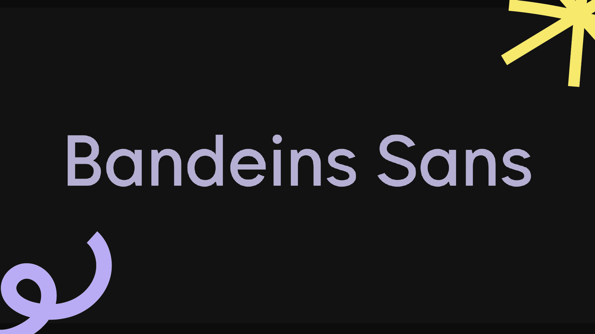
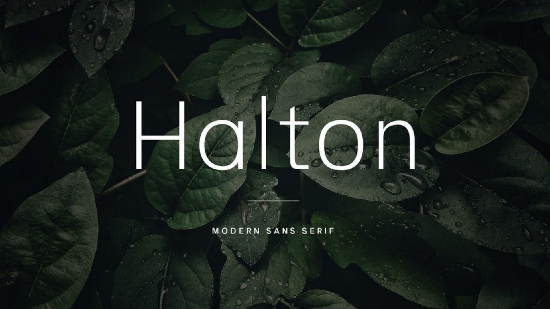
Minimalism Isn't Going Anywhere
While we’re seeing a lot of bold trends, minimalist sans-serif fonts are still holding strong. There’s a reason fonts like Helvetica and Arial have stood the test of time - their clean, simple lines make them incredibly versatile. Rounded geometric sans fonts, with their rounded edges and friendly appearance, also offer a charming and accessible option for various design projects.
We find ourselves reaching for minimalist sans-serifs time and time again, especially for web design and corporate branding. They’re like the little black dress of typography - always in style and appropriate for almost any occasion.
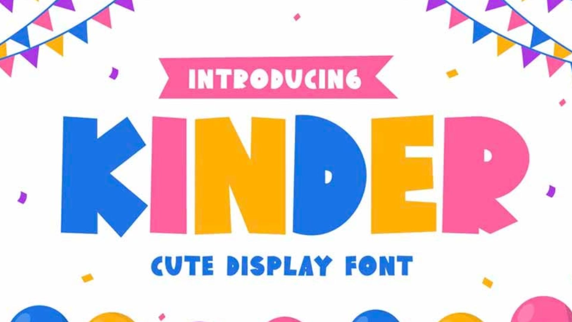
Making a Statement with Bold and Chunky Fonts
Sometimes, you need a display typeface that packs a punch. That’s where a bold display font, with its chunky and commanding presence, comes in. With their thick strokes and commanding presence, these fonts are designed to grab attention and make a statement.
We recently used Impact for a client’s social media campaign, and the results were impressive. The bold typography helped their message stand out in crowded news feeds. If you want your design to shout from the rooftops, give chunky fonts a try.
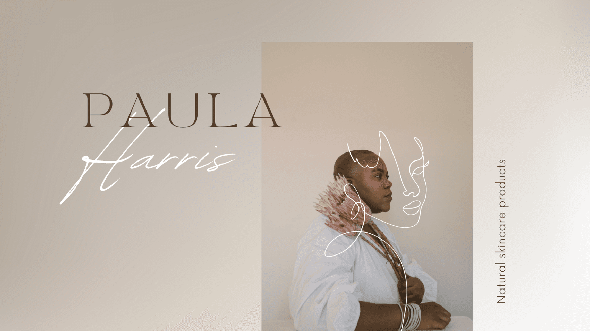
Elegance Personified: High-Contrast Modern Serif Fonts
For designs that need a touch of sophistication, high-contrast serif fonts are our go-to choice. The dramatic difference between thick and thin strokes adds a level of elegance that's hard to match.
Fonts like Bodoni and Didot are perfect for luxury branding or formal invitations. We recently used Playfair Display for an editorial layout, and it added just the right amount of refinement to the page.
Sans Serif Fonts: Versatility and Clarity
Sans serif fonts have long been a staple of modern design, and 2024 is no exception. These fonts are known for their clean lines, simplicity, and versatility, making them perfect for a wide range of applications, from body text to headlines. This year, we’re seeing a resurgence of interest in sans serif fonts, with designers opting for fonts that are both modern and timeless. Fonts like Mont, Aeonik Pro, and Whyte are leading the charge, offering a blend of contemporary aesthetics and classic appeal. Whether you’re working on a sleek website, a corporate identity, or a minimalist poster, sans serif fonts provide the clarity and elegance needed to make your design stand out.
Mid-Century Modern Fonts
Mid-century modern fonts are making a comeback in 2024, with designers drawn to their retro charm and sophistication. These fonts are characterised by their clean lines, geometric shapes, and elegant typography. They evoke a sense of nostalgia while maintaining a timeless appeal, making them perfect for designs that require a touch of glamour and refinement. Whether you’re working on luxury branding, editorial design, or packaging, mid-century modern fonts like Alchaline, Acme Gothic, and Altivo can add a unique and stylish flair to your projects.
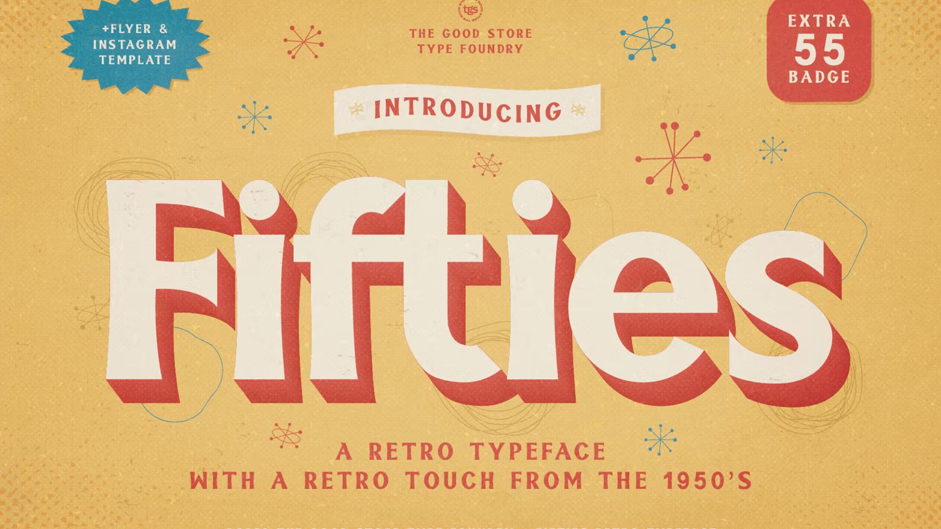
Geometric and Condensed Fonts
Geometric and condensed fonts are also trending in 2024, with designers opting for fonts that are both modern and futuristic. These fonts are characterised by their geometric shapes, clean lines, and condensed letterforms, offering a sleek and contemporary look. They are ideal for designs that require a touch of modernity and sophistication, such as tech branding, editorial design, and advertising. Fonts like Shoal, Glatic, and Corsica are perfect examples of this trend, providing a bold and dynamic aesthetic that can elevate any design.
Art Deco and Ornate Fonts
Art Deco and ornate fonts are making a statement in 2024, with designers drawn to their glamour, sophistication, and elegance. These fonts are characterised by their ornate details, geometric shapes, and luxurious typography, making them perfect for high-end branding, editorial design, and packaging. Whether you’re looking to add a touch of luxury to a brand identity or create a stunning editorial layout, Art Deco and ornate fonts like Blacker Pro, Mixta, and Span can provide the elegance and refinement needed to make your design shine.
Experimental Fonts: Breaking the Mold
If you’re looking to push the boundaries of traditional typography, experimental fonts are the way to go. These fonts are designed to break the mold, incorporating unusual shapes, sizes, and styles that challenge conventional design norms. Experimental fonts can add a unique touch to any project, making them perfect for designers who want to make a bold statement.
One of the defining characteristics of experimental fonts is their use of unconventional shapes and forms. These fonts often feature irregular letterforms, unexpected proportions, and playful designs that catch the eye. Whether it’s a font with exaggerated curves or one that plays with negative space, a gently experimental font brings a sense of creativity and innovation to your work.
Beyond their visual appeal, experimental fonts can also convey specific messages or moods. A bold and playful experimental font might be used to create a fun and energetic vibe, while a more elegant and refined font can evoke a sense of sophistication and luxury. By choosing the right experimental font, you can enhance the emotional impact of your design and create a memorable experience for your audience.
Crafting Identity with Custom Typefaces
In 2024, custom typefaces are becoming an essential tool for creating a unique and consistent visual identity. These fonts are designed specifically for a particular brand or project, allowing designers to craft a cohesive look that sets their work apart from the competition. Custom typefaces can be used in a variety of contexts, from branding and advertising to editorial design and packaging.
One of the key benefits of custom typefaces is their ability to create a distinctive visual identity. By using a custom typeface, designers can ensure that their brand’s typography is instantly recognisable and aligned with their overall aesthetic. This consistency helps build brand recognition and reinforces the brand’s personality and values.
Custom typefaces also offer practical advantages. They can be tailored to meet the specific needs of a project, whether it’s enhancing legibility for body text or adding a unique flair to headlines. For example, a custom typeface might be designed with specific letterforms that improve readability on digital screens, making it ideal for web design. By investing in a custom typeface, you can elevate your design and create a lasting impression.
Best Practices for Using Fonts in 2025
When it comes to using fonts in 2024, there are a few best practices to keep in mind to ensure your designs are both effective and visually appealing:
Choose fonts that are highly legible: Legibility is crucial, especially in contexts where readability is key. Opt for fonts that are clear and easy to read, and avoid overly ornate or decorative fonts that might hinder comprehension.
Use fonts consistently: Consistency is essential for creating a cohesive design. Select a few fonts that complement each other and use them consistently throughout your project to maintain a unified look.
Experiment with different typography styles: Don’t be afraid to mix and match different typography styles. Combining bold and playful fonts with elegant and refined ones can add depth and interest to your design.
Consider the mood and message you want to convey: Different fonts can evoke different emotions and messages. Think about the mood you want to create and choose fonts that align with that vision.
Use custom typefaces to create a unique visual identity: Custom typefaces can help you stand out from the competition by providing a unique and consistent visual identity. Consider investing in a custom typeface to give your brand a distinctive edge.
By following these best practices, you can make the most of the typography trends in 2024 and create designs that are both beautiful and effective. Whether you’re using serif fonts, sans serif fonts, or experimental fonts, the right typography can elevate your work and leave a lasting impression.
Making Typography Trends Work for You
While it’s exciting to experiment with new trends, it’s important to remember that typography is more than just choosing a cool font. Here are a few tips we’ve learned over the years:
Balance is key. Make sure your typographic hierarchy guides the viewer’s eye through the content.
Don’t be afraid to mix and match. Pairing different fonts can create interesting contrasts.
Consistency is crucial, especially for branding. Stick to a primary and secondary font across all your materials.
Never sacrifice readability for style. Make sure your chosen fonts are legible across different devices and sizes.
Choose fonts that align with your brand’s personality. The right typography can speak volumes about your brand values.
Conclusion
As we navigate through 2024, we’re excited to see how these trending fonts evolve and how designers will push the boundaries of what’s possible with type. Whether you’re embracing the flexibility of variable fonts or tapping into nostalgia with retro typefaces, remember that typography is a powerful tool in your design arsenal.
So, go ahead and experiment with these trends. You might just discover a new favourite font or a fresh way to breathe life into your designs. And if you ever need a helping hand or a fresh perspective, don’t hesitate to reach out to us at DesignGuru. We’re here to help you stay ahead of the curve and create designs that truly stand out.
Want to learn more about creating impactful designs? Check out our article on The Role of Typography in Crafting an Engaging Pitch Deck to take your design skills to the next level.
At DesignGuru, we’ve always been fascinated by the power of typography. It’s amazing how the right font can transform a bland design into something truly captivating. With 2025 around the corner, we’ve been noticing some exciting typography and font trends that are breathing new life into the design world. These trends are crucial for crafting distinct and appealing brand identities in both print and digital media. Let’s dive into what’s hot this year and how you can make these trends work for you.
Introduction to 2025 Font Trends
As we step into 2025, the world of typography is buzzing with excitement. This year’s font trends promise to bring a fresh wave of creativity and innovation to the design landscape. From elegant serif fonts to bold sans serif fonts, and from experimental fonts to classic fonts, 2024 has something for every designer. Whether you’re looking to add a touch of sophistication with a modern serif font or make a bold statement with an experimental font, the options are endless. In this article, we’ll delve into the top font trends of 2025, exploring the styles, themes, and inspirations that are shaping the world of typography.
The Evolution of Typography in 2025
Typography in 2024 is a dynamic and ever-evolving field, with new trends and styles emerging at a rapid pace. As technology continues to advance, we’re seeing more innovative and experimental approaches to typography than ever before. From the rise of variable fonts to the increasing popularity of custom typefaces, this year is shaping up to be an exciting one for typography enthusiasts.
One of the standout trends is the evolution of serif fonts. While serif fonts have been a staple in typography for centuries, modern serif fonts are now more elegant and refined. Designers are opting for subtle, nuanced designs that add a touch of sophistication to any project. These contemporary typefaces blend the classic charm of serifs with a modern twist, making them perfect for both digital and print media.
On the other hand, sans serif fonts continue to be a favourite among designers. Their clean, minimalist aesthetic remains in high demand, offering versatility and timeless appeal. From modern geometric sans serif fonts to more traditional designs, sans serif fonts are a go-to choice for projects that require a sleek and professional look. Whether you’re working on a website, a corporate identity, or a marketing campaign, sans serif fonts provide the clarity and simplicity needed to make your message stand out.
The Rise of Variable Fonts
One of the most game-changing developments we’ve seen recently is the growing popularity of variable fonts. If you haven’t heard of them yet, you’re in for a treat. Imagine a single font file that can morph into multiple styles - that’s the magic of variable fonts. They’re incredibly versatile, allowing text to adapt seamlessly across different devices and screen sizes.
We’ve been experimenting with Google Fonts’ Roboto Flex and Inter, and we’re blown away by their flexibility. As a significant font trend, these fonts are perfect for web designers dealing with responsive layouts. They’re perfect for creating dynamic content that looks great on everything from smartphones to desktop monitors.

Nostalgia Strikes Again: The Retro Revival
There’s something comforting about the past, isn’t there? That’s probably why we’re seeing a resurgence of typefaces inspired by the 70s, 80s, and 90s. These retro fonts, often blending contemporary styles with classic fonts, add a unique personality to modern designs, evoking a sense of nostalgia while still feeling fresh.
Incorporating movie fonts into retro designs can further enhance their visual appeal, capturing the essence of different genres and adding a cinematic touch.
We recently used Cooper Black for a client’s branding project, and it was a hit. The vintage vibe perfectly captured the playful essence of their brand. If you’re looking to make a statement with your typography, don’t be afraid to take a trip down memory lane.
The Personal Touch: Handwritten and Script Fonts
In an increasingly digital world, there’s something special about the imperfections of human handwriting. Handwritten and script fonts are having a moment, adding warmth and authenticity to designs. The italic version of these fonts often enhances their charm, providing a unique stylistic variation.
We love using these fonts for projects that need a personal touch. They’re perfect for greeting cards, invitations, and lifestyle brands. One of our go-to handwritten fonts is Pacifico - it never fails to add a dash of charm to any design.

Minimalism Isn't Going Anywhere
While we’re seeing a lot of bold trends, minimalist sans-serif fonts are still holding strong. There’s a reason fonts like Helvetica and Arial have stood the test of time - their clean, simple lines make them incredibly versatile. Rounded geometric sans fonts, with their rounded edges and friendly appearance, also offer a charming and accessible option for various design projects.
We find ourselves reaching for minimalist sans-serifs time and time again, especially for web design and corporate branding. They’re like the little black dress of typography - always in style and appropriate for almost any occasion.

Making a Statement with Bold and Chunky Fonts
Sometimes, you need a display typeface that packs a punch. That’s where a bold display font, with its chunky and commanding presence, comes in. With their thick strokes and commanding presence, these fonts are designed to grab attention and make a statement.
We recently used Impact for a client’s social media campaign, and the results were impressive. The bold typography helped their message stand out in crowded news feeds. If you want your design to shout from the rooftops, give chunky fonts a try.

Elegance Personified: High-Contrast Modern Serif Fonts
For designs that need a touch of sophistication, high-contrast serif fonts are our go-to choice. The dramatic difference between thick and thin strokes adds a level of elegance that's hard to match.
Fonts like Bodoni and Didot are perfect for luxury branding or formal invitations. We recently used Playfair Display for an editorial layout, and it added just the right amount of refinement to the page.
Sans Serif Fonts: Versatility and Clarity
Sans serif fonts have long been a staple of modern design, and 2024 is no exception. These fonts are known for their clean lines, simplicity, and versatility, making them perfect for a wide range of applications, from body text to headlines. This year, we’re seeing a resurgence of interest in sans serif fonts, with designers opting for fonts that are both modern and timeless. Fonts like Mont, Aeonik Pro, and Whyte are leading the charge, offering a blend of contemporary aesthetics and classic appeal. Whether you’re working on a sleek website, a corporate identity, or a minimalist poster, sans serif fonts provide the clarity and elegance needed to make your design stand out.
Mid-Century Modern Fonts
Mid-century modern fonts are making a comeback in 2024, with designers drawn to their retro charm and sophistication. These fonts are characterised by their clean lines, geometric shapes, and elegant typography. They evoke a sense of nostalgia while maintaining a timeless appeal, making them perfect for designs that require a touch of glamour and refinement. Whether you’re working on luxury branding, editorial design, or packaging, mid-century modern fonts like Alchaline, Acme Gothic, and Altivo can add a unique and stylish flair to your projects.

Geometric and Condensed Fonts
Geometric and condensed fonts are also trending in 2024, with designers opting for fonts that are both modern and futuristic. These fonts are characterised by their geometric shapes, clean lines, and condensed letterforms, offering a sleek and contemporary look. They are ideal for designs that require a touch of modernity and sophistication, such as tech branding, editorial design, and advertising. Fonts like Shoal, Glatic, and Corsica are perfect examples of this trend, providing a bold and dynamic aesthetic that can elevate any design.
Art Deco and Ornate Fonts
Art Deco and ornate fonts are making a statement in 2024, with designers drawn to their glamour, sophistication, and elegance. These fonts are characterised by their ornate details, geometric shapes, and luxurious typography, making them perfect for high-end branding, editorial design, and packaging. Whether you’re looking to add a touch of luxury to a brand identity or create a stunning editorial layout, Art Deco and ornate fonts like Blacker Pro, Mixta, and Span can provide the elegance and refinement needed to make your design shine.
Experimental Fonts: Breaking the Mold
If you’re looking to push the boundaries of traditional typography, experimental fonts are the way to go. These fonts are designed to break the mold, incorporating unusual shapes, sizes, and styles that challenge conventional design norms. Experimental fonts can add a unique touch to any project, making them perfect for designers who want to make a bold statement.
One of the defining characteristics of experimental fonts is their use of unconventional shapes and forms. These fonts often feature irregular letterforms, unexpected proportions, and playful designs that catch the eye. Whether it’s a font with exaggerated curves or one that plays with negative space, a gently experimental font brings a sense of creativity and innovation to your work.
Beyond their visual appeal, experimental fonts can also convey specific messages or moods. A bold and playful experimental font might be used to create a fun and energetic vibe, while a more elegant and refined font can evoke a sense of sophistication and luxury. By choosing the right experimental font, you can enhance the emotional impact of your design and create a memorable experience for your audience.
Crafting Identity with Custom Typefaces
In 2024, custom typefaces are becoming an essential tool for creating a unique and consistent visual identity. These fonts are designed specifically for a particular brand or project, allowing designers to craft a cohesive look that sets their work apart from the competition. Custom typefaces can be used in a variety of contexts, from branding and advertising to editorial design and packaging.
One of the key benefits of custom typefaces is their ability to create a distinctive visual identity. By using a custom typeface, designers can ensure that their brand’s typography is instantly recognisable and aligned with their overall aesthetic. This consistency helps build brand recognition and reinforces the brand’s personality and values.
Custom typefaces also offer practical advantages. They can be tailored to meet the specific needs of a project, whether it’s enhancing legibility for body text or adding a unique flair to headlines. For example, a custom typeface might be designed with specific letterforms that improve readability on digital screens, making it ideal for web design. By investing in a custom typeface, you can elevate your design and create a lasting impression.
Best Practices for Using Fonts in 2025
When it comes to using fonts in 2024, there are a few best practices to keep in mind to ensure your designs are both effective and visually appealing:
Choose fonts that are highly legible: Legibility is crucial, especially in contexts where readability is key. Opt for fonts that are clear and easy to read, and avoid overly ornate or decorative fonts that might hinder comprehension.
Use fonts consistently: Consistency is essential for creating a cohesive design. Select a few fonts that complement each other and use them consistently throughout your project to maintain a unified look.
Experiment with different typography styles: Don’t be afraid to mix and match different typography styles. Combining bold and playful fonts with elegant and refined ones can add depth and interest to your design.
Consider the mood and message you want to convey: Different fonts can evoke different emotions and messages. Think about the mood you want to create and choose fonts that align with that vision.
Use custom typefaces to create a unique visual identity: Custom typefaces can help you stand out from the competition by providing a unique and consistent visual identity. Consider investing in a custom typeface to give your brand a distinctive edge.
By following these best practices, you can make the most of the typography trends in 2024 and create designs that are both beautiful and effective. Whether you’re using serif fonts, sans serif fonts, or experimental fonts, the right typography can elevate your work and leave a lasting impression.
Making Typography Trends Work for You
While it’s exciting to experiment with new trends, it’s important to remember that typography is more than just choosing a cool font. Here are a few tips we’ve learned over the years:
Balance is key. Make sure your typographic hierarchy guides the viewer’s eye through the content.
Don’t be afraid to mix and match. Pairing different fonts can create interesting contrasts.
Consistency is crucial, especially for branding. Stick to a primary and secondary font across all your materials.
Never sacrifice readability for style. Make sure your chosen fonts are legible across different devices and sizes.
Choose fonts that align with your brand’s personality. The right typography can speak volumes about your brand values.
Conclusion
As we navigate through 2024, we’re excited to see how these trending fonts evolve and how designers will push the boundaries of what’s possible with type. Whether you’re embracing the flexibility of variable fonts or tapping into nostalgia with retro typefaces, remember that typography is a powerful tool in your design arsenal.
So, go ahead and experiment with these trends. You might just discover a new favourite font or a fresh way to breathe life into your designs. And if you ever need a helping hand or a fresh perspective, don’t hesitate to reach out to us at DesignGuru. We’re here to help you stay ahead of the curve and create designs that truly stand out.
Want to learn more about creating impactful designs? Check out our article on The Role of Typography in Crafting an Engaging Pitch Deck to take your design skills to the next level.
At DesignGuru, we’ve always been fascinated by the power of typography. It’s amazing how the right font can transform a bland design into something truly captivating. With 2025 around the corner, we’ve been noticing some exciting typography and font trends that are breathing new life into the design world. These trends are crucial for crafting distinct and appealing brand identities in both print and digital media. Let’s dive into what’s hot this year and how you can make these trends work for you.
Introduction to 2025 Font Trends
As we step into 2025, the world of typography is buzzing with excitement. This year’s font trends promise to bring a fresh wave of creativity and innovation to the design landscape. From elegant serif fonts to bold sans serif fonts, and from experimental fonts to classic fonts, 2024 has something for every designer. Whether you’re looking to add a touch of sophistication with a modern serif font or make a bold statement with an experimental font, the options are endless. In this article, we’ll delve into the top font trends of 2025, exploring the styles, themes, and inspirations that are shaping the world of typography.
The Evolution of Typography in 2025
Typography in 2024 is a dynamic and ever-evolving field, with new trends and styles emerging at a rapid pace. As technology continues to advance, we’re seeing more innovative and experimental approaches to typography than ever before. From the rise of variable fonts to the increasing popularity of custom typefaces, this year is shaping up to be an exciting one for typography enthusiasts.
One of the standout trends is the evolution of serif fonts. While serif fonts have been a staple in typography for centuries, modern serif fonts are now more elegant and refined. Designers are opting for subtle, nuanced designs that add a touch of sophistication to any project. These contemporary typefaces blend the classic charm of serifs with a modern twist, making them perfect for both digital and print media.
On the other hand, sans serif fonts continue to be a favourite among designers. Their clean, minimalist aesthetic remains in high demand, offering versatility and timeless appeal. From modern geometric sans serif fonts to more traditional designs, sans serif fonts are a go-to choice for projects that require a sleek and professional look. Whether you’re working on a website, a corporate identity, or a marketing campaign, sans serif fonts provide the clarity and simplicity needed to make your message stand out.
The Rise of Variable Fonts
One of the most game-changing developments we’ve seen recently is the growing popularity of variable fonts. If you haven’t heard of them yet, you’re in for a treat. Imagine a single font file that can morph into multiple styles - that’s the magic of variable fonts. They’re incredibly versatile, allowing text to adapt seamlessly across different devices and screen sizes.
We’ve been experimenting with Google Fonts’ Roboto Flex and Inter, and we’re blown away by their flexibility. As a significant font trend, these fonts are perfect for web designers dealing with responsive layouts. They’re perfect for creating dynamic content that looks great on everything from smartphones to desktop monitors.

Nostalgia Strikes Again: The Retro Revival
There’s something comforting about the past, isn’t there? That’s probably why we’re seeing a resurgence of typefaces inspired by the 70s, 80s, and 90s. These retro fonts, often blending contemporary styles with classic fonts, add a unique personality to modern designs, evoking a sense of nostalgia while still feeling fresh.
Incorporating movie fonts into retro designs can further enhance their visual appeal, capturing the essence of different genres and adding a cinematic touch.
We recently used Cooper Black for a client’s branding project, and it was a hit. The vintage vibe perfectly captured the playful essence of their brand. If you’re looking to make a statement with your typography, don’t be afraid to take a trip down memory lane.
The Personal Touch: Handwritten and Script Fonts
In an increasingly digital world, there’s something special about the imperfections of human handwriting. Handwritten and script fonts are having a moment, adding warmth and authenticity to designs. The italic version of these fonts often enhances their charm, providing a unique stylistic variation.
We love using these fonts for projects that need a personal touch. They’re perfect for greeting cards, invitations, and lifestyle brands. One of our go-to handwritten fonts is Pacifico - it never fails to add a dash of charm to any design.

Minimalism Isn't Going Anywhere
While we’re seeing a lot of bold trends, minimalist sans-serif fonts are still holding strong. There’s a reason fonts like Helvetica and Arial have stood the test of time - their clean, simple lines make them incredibly versatile. Rounded geometric sans fonts, with their rounded edges and friendly appearance, also offer a charming and accessible option for various design projects.
We find ourselves reaching for minimalist sans-serifs time and time again, especially for web design and corporate branding. They’re like the little black dress of typography - always in style and appropriate for almost any occasion.

Making a Statement with Bold and Chunky Fonts
Sometimes, you need a display typeface that packs a punch. That’s where a bold display font, with its chunky and commanding presence, comes in. With their thick strokes and commanding presence, these fonts are designed to grab attention and make a statement.
We recently used Impact for a client’s social media campaign, and the results were impressive. The bold typography helped their message stand out in crowded news feeds. If you want your design to shout from the rooftops, give chunky fonts a try.

Elegance Personified: High-Contrast Modern Serif Fonts
For designs that need a touch of sophistication, high-contrast serif fonts are our go-to choice. The dramatic difference between thick and thin strokes adds a level of elegance that's hard to match.
Fonts like Bodoni and Didot are perfect for luxury branding or formal invitations. We recently used Playfair Display for an editorial layout, and it added just the right amount of refinement to the page.
Sans Serif Fonts: Versatility and Clarity
Sans serif fonts have long been a staple of modern design, and 2024 is no exception. These fonts are known for their clean lines, simplicity, and versatility, making them perfect for a wide range of applications, from body text to headlines. This year, we’re seeing a resurgence of interest in sans serif fonts, with designers opting for fonts that are both modern and timeless. Fonts like Mont, Aeonik Pro, and Whyte are leading the charge, offering a blend of contemporary aesthetics and classic appeal. Whether you’re working on a sleek website, a corporate identity, or a minimalist poster, sans serif fonts provide the clarity and elegance needed to make your design stand out.
Mid-Century Modern Fonts
Mid-century modern fonts are making a comeback in 2024, with designers drawn to their retro charm and sophistication. These fonts are characterised by their clean lines, geometric shapes, and elegant typography. They evoke a sense of nostalgia while maintaining a timeless appeal, making them perfect for designs that require a touch of glamour and refinement. Whether you’re working on luxury branding, editorial design, or packaging, mid-century modern fonts like Alchaline, Acme Gothic, and Altivo can add a unique and stylish flair to your projects.

Geometric and Condensed Fonts
Geometric and condensed fonts are also trending in 2024, with designers opting for fonts that are both modern and futuristic. These fonts are characterised by their geometric shapes, clean lines, and condensed letterforms, offering a sleek and contemporary look. They are ideal for designs that require a touch of modernity and sophistication, such as tech branding, editorial design, and advertising. Fonts like Shoal, Glatic, and Corsica are perfect examples of this trend, providing a bold and dynamic aesthetic that can elevate any design.
Art Deco and Ornate Fonts
Art Deco and ornate fonts are making a statement in 2024, with designers drawn to their glamour, sophistication, and elegance. These fonts are characterised by their ornate details, geometric shapes, and luxurious typography, making them perfect for high-end branding, editorial design, and packaging. Whether you’re looking to add a touch of luxury to a brand identity or create a stunning editorial layout, Art Deco and ornate fonts like Blacker Pro, Mixta, and Span can provide the elegance and refinement needed to make your design shine.
Experimental Fonts: Breaking the Mold
If you’re looking to push the boundaries of traditional typography, experimental fonts are the way to go. These fonts are designed to break the mold, incorporating unusual shapes, sizes, and styles that challenge conventional design norms. Experimental fonts can add a unique touch to any project, making them perfect for designers who want to make a bold statement.
One of the defining characteristics of experimental fonts is their use of unconventional shapes and forms. These fonts often feature irregular letterforms, unexpected proportions, and playful designs that catch the eye. Whether it’s a font with exaggerated curves or one that plays with negative space, a gently experimental font brings a sense of creativity and innovation to your work.
Beyond their visual appeal, experimental fonts can also convey specific messages or moods. A bold and playful experimental font might be used to create a fun and energetic vibe, while a more elegant and refined font can evoke a sense of sophistication and luxury. By choosing the right experimental font, you can enhance the emotional impact of your design and create a memorable experience for your audience.
Crafting Identity with Custom Typefaces
In 2024, custom typefaces are becoming an essential tool for creating a unique and consistent visual identity. These fonts are designed specifically for a particular brand or project, allowing designers to craft a cohesive look that sets their work apart from the competition. Custom typefaces can be used in a variety of contexts, from branding and advertising to editorial design and packaging.
One of the key benefits of custom typefaces is their ability to create a distinctive visual identity. By using a custom typeface, designers can ensure that their brand’s typography is instantly recognisable and aligned with their overall aesthetic. This consistency helps build brand recognition and reinforces the brand’s personality and values.
Custom typefaces also offer practical advantages. They can be tailored to meet the specific needs of a project, whether it’s enhancing legibility for body text or adding a unique flair to headlines. For example, a custom typeface might be designed with specific letterforms that improve readability on digital screens, making it ideal for web design. By investing in a custom typeface, you can elevate your design and create a lasting impression.
Best Practices for Using Fonts in 2025
When it comes to using fonts in 2024, there are a few best practices to keep in mind to ensure your designs are both effective and visually appealing:
Choose fonts that are highly legible: Legibility is crucial, especially in contexts where readability is key. Opt for fonts that are clear and easy to read, and avoid overly ornate or decorative fonts that might hinder comprehension.
Use fonts consistently: Consistency is essential for creating a cohesive design. Select a few fonts that complement each other and use them consistently throughout your project to maintain a unified look.
Experiment with different typography styles: Don’t be afraid to mix and match different typography styles. Combining bold and playful fonts with elegant and refined ones can add depth and interest to your design.
Consider the mood and message you want to convey: Different fonts can evoke different emotions and messages. Think about the mood you want to create and choose fonts that align with that vision.
Use custom typefaces to create a unique visual identity: Custom typefaces can help you stand out from the competition by providing a unique and consistent visual identity. Consider investing in a custom typeface to give your brand a distinctive edge.
By following these best practices, you can make the most of the typography trends in 2024 and create designs that are both beautiful and effective. Whether you’re using serif fonts, sans serif fonts, or experimental fonts, the right typography can elevate your work and leave a lasting impression.
Making Typography Trends Work for You
While it’s exciting to experiment with new trends, it’s important to remember that typography is more than just choosing a cool font. Here are a few tips we’ve learned over the years:
Balance is key. Make sure your typographic hierarchy guides the viewer’s eye through the content.
Don’t be afraid to mix and match. Pairing different fonts can create interesting contrasts.
Consistency is crucial, especially for branding. Stick to a primary and secondary font across all your materials.
Never sacrifice readability for style. Make sure your chosen fonts are legible across different devices and sizes.
Choose fonts that align with your brand’s personality. The right typography can speak volumes about your brand values.
Conclusion
As we navigate through 2024, we’re excited to see how these trending fonts evolve and how designers will push the boundaries of what’s possible with type. Whether you’re embracing the flexibility of variable fonts or tapping into nostalgia with retro typefaces, remember that typography is a powerful tool in your design arsenal.
So, go ahead and experiment with these trends. You might just discover a new favourite font or a fresh way to breathe life into your designs. And if you ever need a helping hand or a fresh perspective, don’t hesitate to reach out to us at DesignGuru. We’re here to help you stay ahead of the curve and create designs that truly stand out.
Want to learn more about creating impactful designs? Check out our article on The Role of Typography in Crafting an Engaging Pitch Deck to take your design skills to the next level.
Related blogs
Related blogs

Ready to supercharge your business?
See why 96+ happy customers love working with us!

Flexible subscription

No contracts
Branding
Ad Design & Creative
Presentations
Illustrations
UX & UI Design
Video & Animation
Print Design

Ready to supercharge your business?
See why 96+ happy customers love working with us!

Flexible subscription

No contracts
Branding
Ad Design & Creative
Presentations
Illustrations
UX & UI Design
Video & Animation
Print Design

Ready to supercharge your business?
See why 96+ happy customers love working with us!

Flexible subscription

No contracts
Branding
Ad Design & Creative
Presentations
Illustrations
UX & UI Design
Video & Animation
Print Design

