
In the competitive world of startups, your homepage is your digital handshake—a crucial first impression that can make or break user engagement. At DesignGuru, we’ve helped numerous startups skyrocket their conversion rates through strategic UI design. This article walks you through the essential elements of creating a high-converting homepage UI tailored for startups in 2024, focusing on key strategies like conversion rate optimisation.
The Critical Role of UI Design for Startup Success
Before getting into the specifics, let’s look at some eye-opening statistics:
94% of first impressions are design-related (CXL)
Users form an opinion about your website in a mere 0.05 seconds (CXL)
38% of people will stop engaging with a website if the content or layout is unattractive (Adobe)
For startups, these numbers aren’t just interesting—they’re make-or-break. Your homepage UI isn’t merely about aesthetics; it’s a powerful conversion tool, a brand builder, and a growth catalyst. It needs to look good, absolutely, but more crucially, it needs to perform exceptionally well through effective web design. Expert web designers play a crucial role in crafting these high-performing homepages, ensuring that every design element contributes to the overall conversion strategy.
Understanding High-Converting Websites
A high-converting website is meticulously designed to maximize the number of conversions—whether that’s sales, sign-ups, or downloads—from website visitors. High converting websites typically feature a clear and focused message, a well-thought-out user experience, and compelling calls-to-action (CTAs). The cornerstone of a high converting website is a deep understanding of the target audience. This includes knowing their needs, preferences, and behaviors. By tailoring the website’s design, content, and functionality to meet these specific needs, businesses can significantly increase their chances of conversion. In essence, a high converting website is not just about aesthetics; it’s about creating a seamless journey that guides visitors towards taking the desired action.
Key UI Design Elements for a Startup Landing Page
A Clear and Compelling Value Proposition
Your value proposition is the cornerstone of your homepage UI. It should answer one simple question: "Why should a user choose your startup over established competitors?"
Do This: Place your value proposition front and center in your UI, typically in the hero section. Use clear, benefit-driven language that speaks directly to your target audience's pain points.
Example: Stripe's homepage nails this with "Financial infrastructure to grow your revenue." It's clear, concise, and immediately communicates their value.
Don't Do This: Avoid vague, jargon-filled statements that could apply to any business. "We innovate solutions" tells your visitors nothing. "We help startups increase conversion rates by 200% in 60 days" tells them everything.

Intuitive Navigation Design
Your navigation UI is the roadmap to your startup's offerings. If it's confusing or cluttered, visitors will bounce faster than you can say "seed funding."
Do This: Keep your main navigation simple and limited to 5-7 items. Use clear, descriptive labels that your users will understand. Consider using a "hamburger" menu for mobile to keep the UI clean.
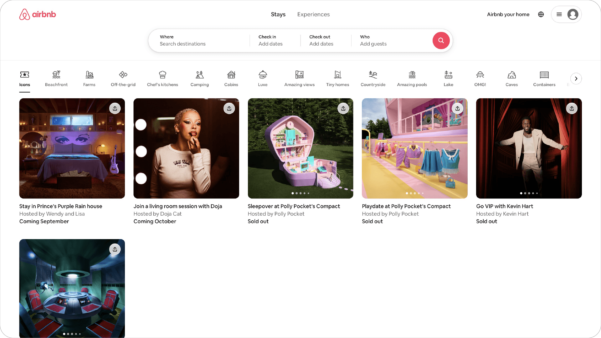
Example: Airbnb's navigation is a masterclass in simplicity and clarity. With just a few options like "Stays" "Experiences," and "AirBnb your home," users can easily find what they're looking for.
Don't Do This: Avoid using clever or trendy names for your navigation items. "Our Awesome Tech" might sound cool, but "Products" is clearer and more effective.
Engaging Visual UI Elements
In the startup world, standing out visually is crucial. High-quality, relevant images, illustrations, or videos can significantly boost engagement and convey your brand’s innovative spirit.
Do This: Use authentic, high-quality visuals that represent your startup’s unique value. If you’re a SaaS startup, show real screenshots or demos of your product in action.
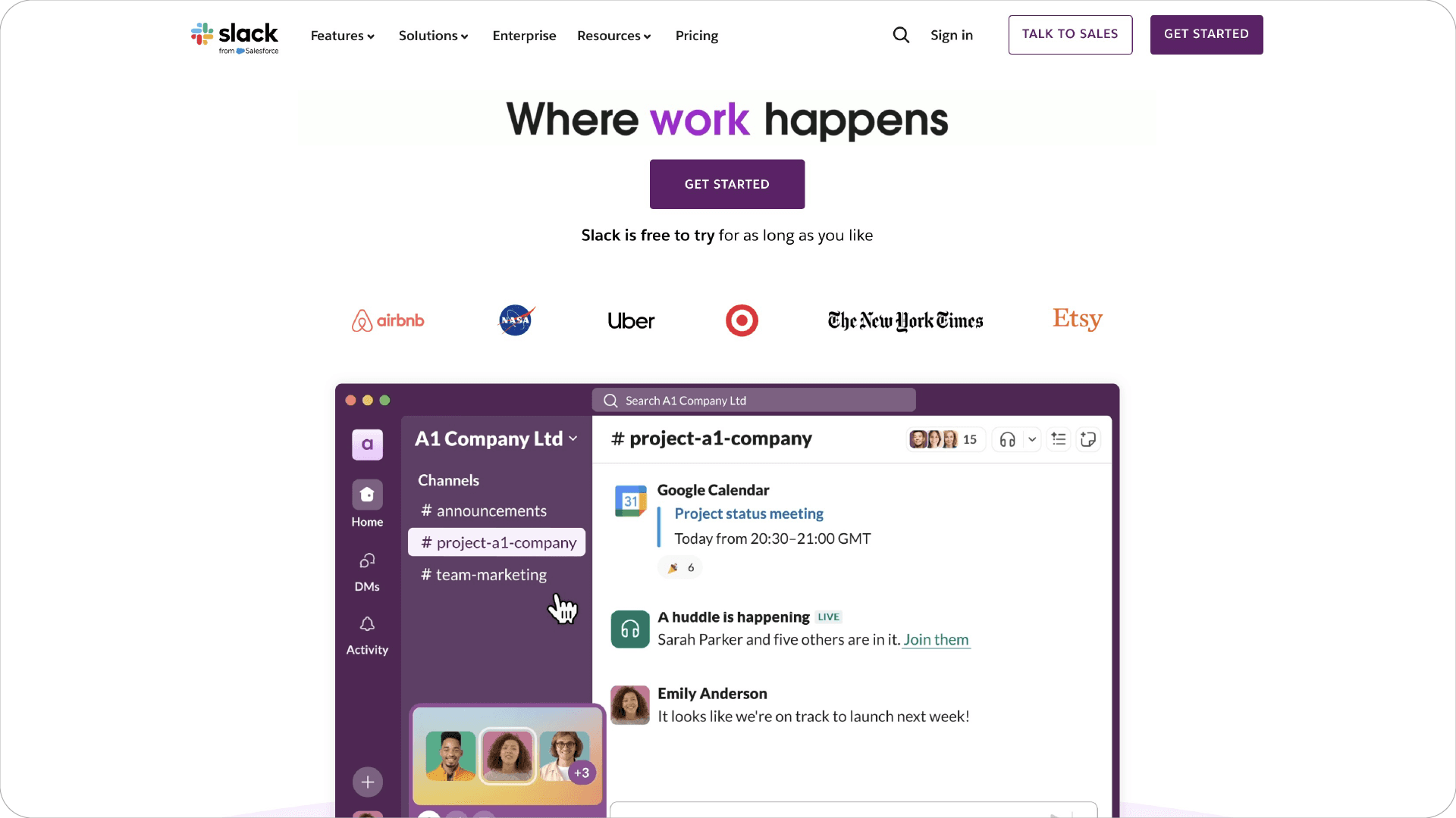
Example: Slack’s homepage uses actual product screenshots to give visitors a clear idea of what the platform looks like and how it works.
Don’t Do This: Don’t overload your homepage with flashy animations or auto-playing videos. They can be distracting and may slow down your site’s load time—a critical factor for startups aiming for rapid growth and ensuring a fast page load.
Clear Call-to-Action (CTA) Design
For startups, every conversion counts. Your CTAs need to be clear, compelling, and strategically placed within your UI.
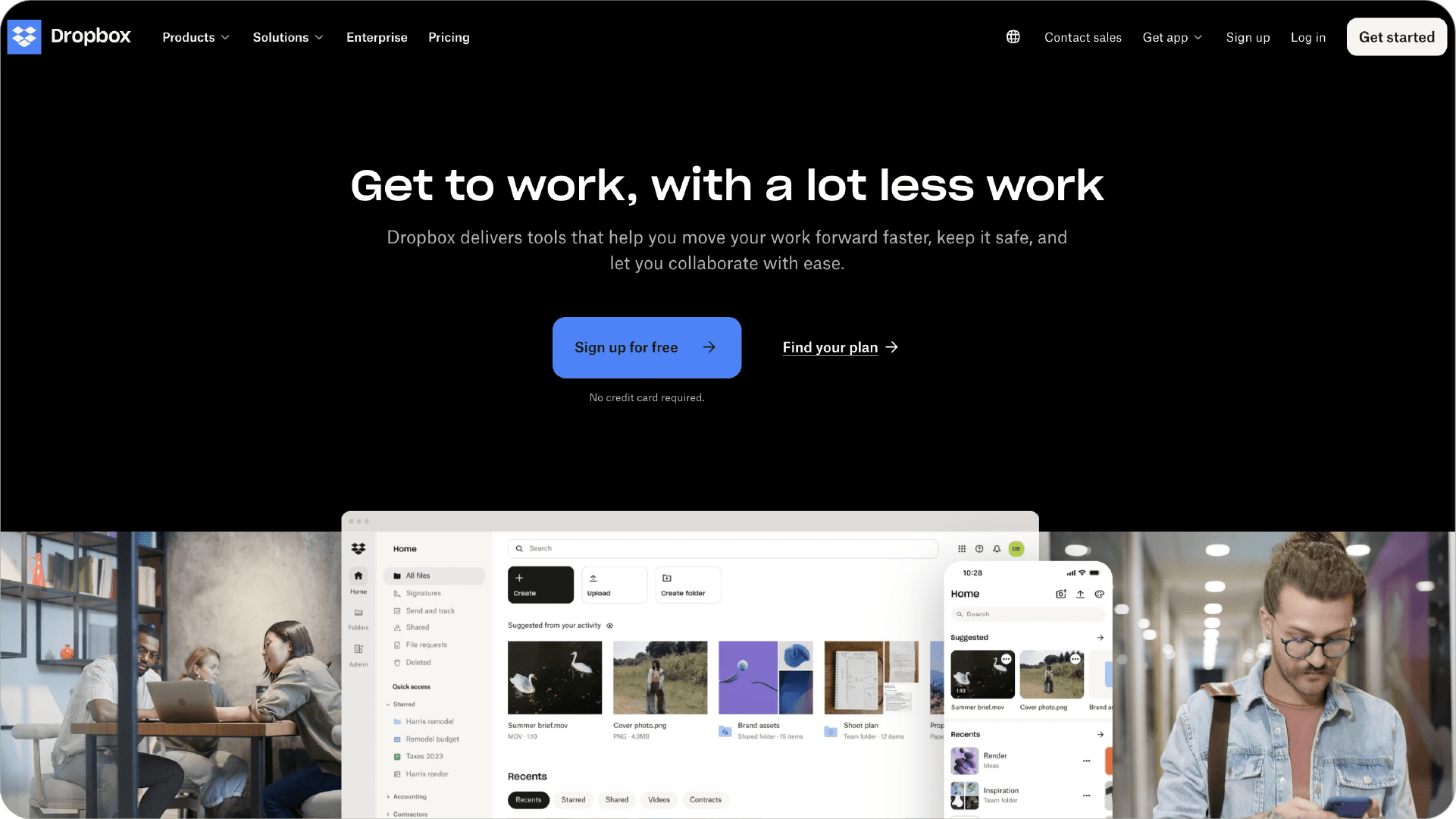
Do This: Use action-oriented language for your CTAs ("Start Your Free Trial," "Get Early Access"). Make them visually distinct from the rest of your page elements, using contrasting colors or button designs.
Example: Dropbox Business has a clear, contrasting "Sign up for free" button right in the hero section of their homepage. It's impossible to miss and the offer is enticing.
Don't Do This: Don't overwhelm visitors with too many CTAs. Focus on one primary action you want visitors to take, and make that CTA the most prominent UI element.
Social Proof UI Elements
In the startup ecosystem, trust is everything. Incorporate elements of social proof in your UI to boost your credibility.
Do This: Include customer testimonials, trust badges, client or partner logos, or case study snippets. If you have impressive metrics (like "500% growth in 6 months"), showcase them prominently in your UI.
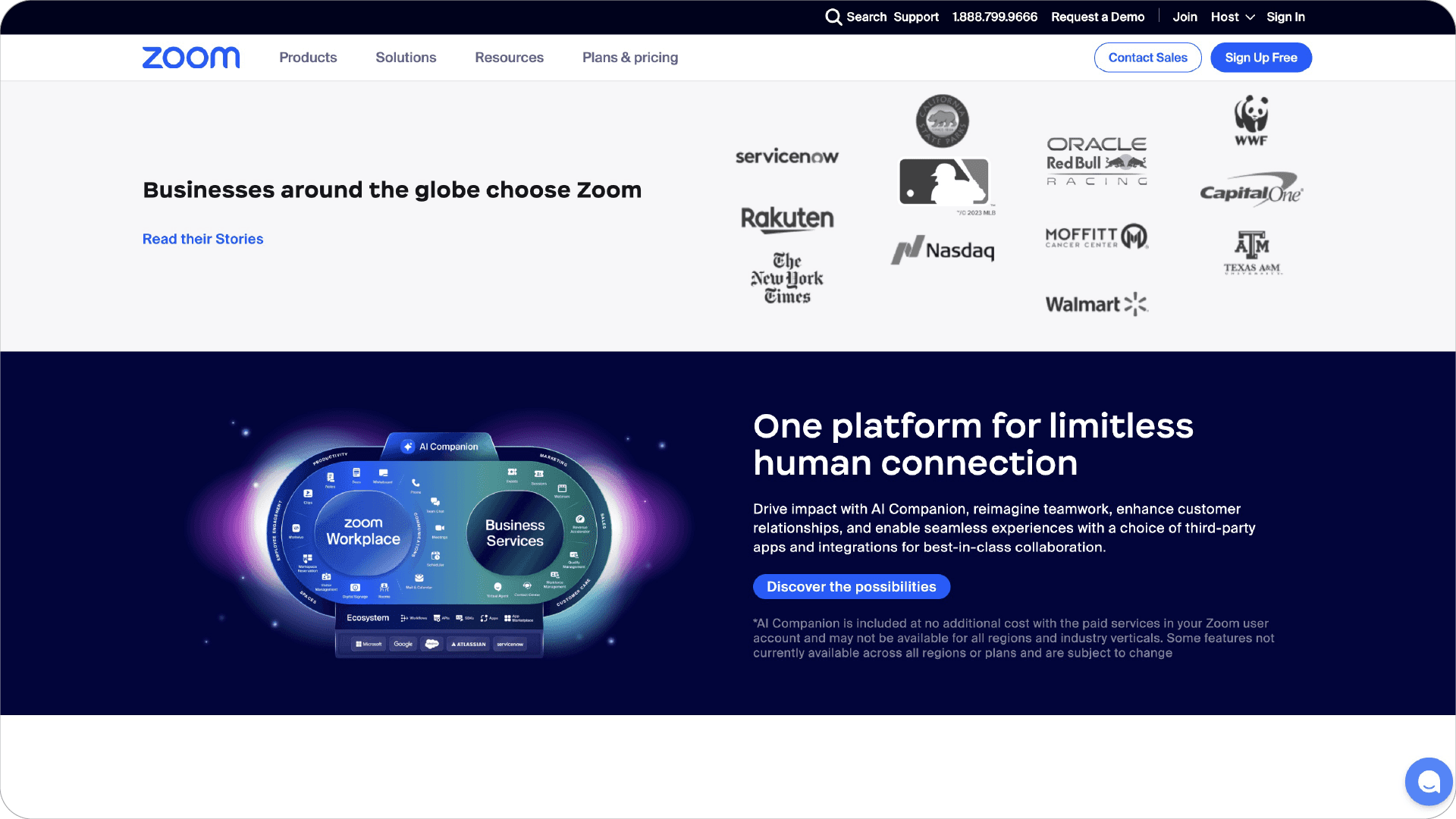
Example: Zoom's homepage features logos of well-known companies that use their service, immediately building credibility with potential customers.
Don't Do This: Don't use fake testimonials or inflated numbers. Authenticity is key in the startup world, and savvy investors and customers can spot a fake a mile away.
Mobile-Responsive UI Design
With mobile traffic accounting for over 50% of web traffic worldwide, responsive web design isn’t optional for startups—it’s essential.
Do This: Design with a mobile-first approach. Ensure that all critical information is easily accessible on smaller screens, and that your CTAs are tap-friendly.
Example: Mailchimp’s mobile site is a stellar example of responsive design. They’ve thoughtfully reorganised their content for smaller screens, maintaining functionality without sacrificing style. The hamburger menu neatly tucks away navigation options, while key features and CTAs remain prominent and easily tappable.
Don’t Do This: Don’t simply shrink your desktop UI for mobile. Rethink the mobile experience from the ground up, considering factors like touch navigation and reduced screen real estate.

Design Principles for High-Converting Homepages
A high-converting homepage is essential for driving revenue and achieving business goals. To design a homepage that converts, businesses should prioritise several key elements. Clear product imagery is crucial—it should be high-quality and immediately convey the value of the product or service. Prominent calls-to-action (CTAs) should be strategically placed to guide visitors towards taking the next step, whether that’s signing up, purchasing, or learning more. Intuitive navigation menus help users find what they’re looking for quickly and easily, reducing friction in their journey. Engaging banners or sliders can capture attention and highlight important offers or features. Additionally, with more than half of global internet traffic coming from mobile devices, it’s imperative that the homepage is optimised for mobile. This means ensuring that all elements are easily accessible and functional on smaller screens, providing a seamless experience regardless of the device used.
Best Practices for High-Converting Homepages
Creating a high-converting homepage involves following best practices that enhance user experience and drive conversions. Start by prioritising clear and high-quality product imagery that immediately communicates value. Use prominent and action-oriented calls-to-action (CTAs) to guide visitors towards desired actions. Intuitive navigation menus are essential for helping users find what they need without frustration. Engaging banners or sliders can be used to highlight key offers or features, capturing visitors’ attention right away. Additionally, ensure that your homepage is fast, secure, and provides a seamless user experience across all devices. By adhering to these best practices, businesses can significantly increase their website’s conversion rate, turning more visitors into customers and driving revenue growth.
Measuring and Optimizing Performance
To ensure your website remains a high-converting powerhouse, it’s crucial to measure its performance regularly. Key metrics to track include bounce rate, time on page, conversion rate, and click-through rate on calls-to-action. Gathering feedback from users is equally important. Utilise methods such as user testing, surveys, heat maps, session recordings, and analysing customer support inquiries or complaints to gain insights into user behavior and pain points. By analysing these metrics and feedback, businesses can identify areas for improvement and optimise their website’s design, content, and functionality to boost conversions. Regular optimisation is a critical element of conversion rate optimisation. Continuously testing, analysing, and refining your website will help you stay ahead of the competition and adapt to evolving user behaviours, ensuring sustained high conversion rates.
Ready to Elevate Your Startup's Homepage?
Now that you're armed with the knowledge of what makes a high-converting homepage UI for startups, you might be wondering how to put these principles into action. That's where DesignGuru comes in.
Why Choose DesignGuru for Your Startup's UI Design?
Startup-Focused Expertise: We understand the unique challenges and opportunities that startups face in the digital landscape.
Data-Driven Design: Our designs aren't just pretty—they're based on conversion optimization principles and user behaviour data.
Rapid Iteration: In the fast-paced startup world, we know that speed matters. Our agile design process ensures quick turnarounds without compromising quality.
Scalable Solutions: We create designs that can grow with your startup, from MVP to unicorn status.
Conversion-Centric Approach: Every UI element we design is geared towards boosting your conversion rates and driving business growth.
Ready to transform your startup's homepage into a conversion powerhouse? We invite you to check out our UI design portfolio and see the results we've achieved for startups just like yours.
Conclusion
Remember, your homepage UI is often the first pitch you make to potential customers, investors, and partners. It needs to be more than just visually appealing—it should be a conversion machine that clearly communicates your value, builds trust, and guides visitors towards taking action.
Don't leave your startup's success to chance. Partner with DesignGuru and let's craft a homepage UI that sets you apart in the competitive startup landscape. Book a call with us here to find out more.
In the competitive world of startups, your homepage is your digital handshake—a crucial first impression that can make or break user engagement. At DesignGuru, we’ve helped numerous startups skyrocket their conversion rates through strategic UI design. This article walks you through the essential elements of creating a high-converting homepage UI tailored for startups in 2024, focusing on key strategies like conversion rate optimisation.
The Critical Role of UI Design for Startup Success
Before getting into the specifics, let’s look at some eye-opening statistics:
94% of first impressions are design-related (CXL)
Users form an opinion about your website in a mere 0.05 seconds (CXL)
38% of people will stop engaging with a website if the content or layout is unattractive (Adobe)
For startups, these numbers aren’t just interesting—they’re make-or-break. Your homepage UI isn’t merely about aesthetics; it’s a powerful conversion tool, a brand builder, and a growth catalyst. It needs to look good, absolutely, but more crucially, it needs to perform exceptionally well through effective web design. Expert web designers play a crucial role in crafting these high-performing homepages, ensuring that every design element contributes to the overall conversion strategy.
Understanding High-Converting Websites
A high-converting website is meticulously designed to maximize the number of conversions—whether that’s sales, sign-ups, or downloads—from website visitors. High converting websites typically feature a clear and focused message, a well-thought-out user experience, and compelling calls-to-action (CTAs). The cornerstone of a high converting website is a deep understanding of the target audience. This includes knowing their needs, preferences, and behaviors. By tailoring the website’s design, content, and functionality to meet these specific needs, businesses can significantly increase their chances of conversion. In essence, a high converting website is not just about aesthetics; it’s about creating a seamless journey that guides visitors towards taking the desired action.
Key UI Design Elements for a Startup Landing Page
A Clear and Compelling Value Proposition
Your value proposition is the cornerstone of your homepage UI. It should answer one simple question: "Why should a user choose your startup over established competitors?"
Do This: Place your value proposition front and center in your UI, typically in the hero section. Use clear, benefit-driven language that speaks directly to your target audience's pain points.
Example: Stripe's homepage nails this with "Financial infrastructure to grow your revenue." It's clear, concise, and immediately communicates their value.
Don't Do This: Avoid vague, jargon-filled statements that could apply to any business. "We innovate solutions" tells your visitors nothing. "We help startups increase conversion rates by 200% in 60 days" tells them everything.

Intuitive Navigation Design
Your navigation UI is the roadmap to your startup's offerings. If it's confusing or cluttered, visitors will bounce faster than you can say "seed funding."
Do This: Keep your main navigation simple and limited to 5-7 items. Use clear, descriptive labels that your users will understand. Consider using a "hamburger" menu for mobile to keep the UI clean.
Example: Airbnb's navigation is a masterclass in simplicity and clarity. With just a few options like "Stays" "Experiences," and "AirBnb your home," users can easily find what they're looking for.
Don't Do This: Avoid using clever or trendy names for your navigation items. "Our Awesome Tech" might sound cool, but "Products" is clearer and more effective.

Engaging Visual UI Elements
In the startup world, standing out visually is crucial. High-quality, relevant images, illustrations, or videos can significantly boost engagement and convey your brand’s innovative spirit.
Do This: Use authentic, high-quality visuals that represent your startup’s unique value. If you’re a SaaS startup, show real screenshots or demos of your product in action.
Example: Slack’s homepage uses actual product screenshots to give visitors a clear idea of what the platform looks like and how it works.
Don’t Do This: Don’t overload your homepage with flashy animations or auto-playing videos. They can be distracting and may slow down your site’s load time—a critical factor for startups aiming for rapid growth and ensuring a fast page load.

Clear Call-to-Action (CTA) Design
For startups, every conversion counts. Your CTAs need to be clear, compelling, and strategically placed within your UI.
Do This: Use action-oriented language for your CTAs ("Start Your Free Trial," "Get Early Access"). Make them visually distinct from the rest of your page elements, using contrasting colors or button designs.
Example: Dropbox Business has a clear, contrasting "Sign up for free" button right in the hero section of their homepage. It's impossible to miss and the offer is enticing.
Don't Do This: Don't overwhelm visitors with too many CTAs. Focus on one primary action you want visitors to take, and make that CTA the most prominent UI element.

Social Proof UI Elements
In the startup ecosystem, trust is everything. Incorporate elements of social proof in your UI to boost your credibility.
Do This: Include customer testimonials, trust badges, client or partner logos, or case study snippets. If you have impressive metrics (like "500% growth in 6 months"), showcase them prominently in your UI.
Example: Zoom's homepage features logos of well-known companies that use their service, immediately building credibility with potential customers.
Don't Do This: Don't use fake testimonials or inflated numbers. Authenticity is key in the startup world, and savvy investors and customers can spot a fake a mile away.

Mobile-Responsive UI Design
With mobile traffic accounting for over 50% of web traffic worldwide, responsive web design isn’t optional for startups—it’s essential.
Do This: Design with a mobile-first approach. Ensure that all critical information is easily accessible on smaller screens, and that your CTAs are tap-friendly.
Example: Mailchimp’s mobile site is a stellar example of responsive design. They’ve thoughtfully reorganised their content for smaller screens, maintaining functionality without sacrificing style. The hamburger menu neatly tucks away navigation options, while key features and CTAs remain prominent and easily tappable.
Don’t Do This: Don’t simply shrink your desktop UI for mobile. Rethink the mobile experience from the ground up, considering factors like touch navigation and reduced screen real estate.

Design Principles for High-Converting Homepages
A high-converting homepage is essential for driving revenue and achieving business goals. To design a homepage that converts, businesses should prioritise several key elements. Clear product imagery is crucial—it should be high-quality and immediately convey the value of the product or service. Prominent calls-to-action (CTAs) should be strategically placed to guide visitors towards taking the next step, whether that’s signing up, purchasing, or learning more. Intuitive navigation menus help users find what they’re looking for quickly and easily, reducing friction in their journey. Engaging banners or sliders can capture attention and highlight important offers or features. Additionally, with more than half of global internet traffic coming from mobile devices, it’s imperative that the homepage is optimised for mobile. This means ensuring that all elements are easily accessible and functional on smaller screens, providing a seamless experience regardless of the device used.
Best Practices for High-Converting Homepages
Creating a high-converting homepage involves following best practices that enhance user experience and drive conversions. Start by prioritising clear and high-quality product imagery that immediately communicates value. Use prominent and action-oriented calls-to-action (CTAs) to guide visitors towards desired actions. Intuitive navigation menus are essential for helping users find what they need without frustration. Engaging banners or sliders can be used to highlight key offers or features, capturing visitors’ attention right away. Additionally, ensure that your homepage is fast, secure, and provides a seamless user experience across all devices. By adhering to these best practices, businesses can significantly increase their website’s conversion rate, turning more visitors into customers and driving revenue growth.
Measuring and Optimizing Performance
To ensure your website remains a high-converting powerhouse, it’s crucial to measure its performance regularly. Key metrics to track include bounce rate, time on page, conversion rate, and click-through rate on calls-to-action. Gathering feedback from users is equally important. Utilise methods such as user testing, surveys, heat maps, session recordings, and analysing customer support inquiries or complaints to gain insights into user behavior and pain points. By analysing these metrics and feedback, businesses can identify areas for improvement and optimise their website’s design, content, and functionality to boost conversions. Regular optimisation is a critical element of conversion rate optimisation. Continuously testing, analysing, and refining your website will help you stay ahead of the competition and adapt to evolving user behaviours, ensuring sustained high conversion rates.
Ready to Elevate Your Startup's Homepage?
Now that you're armed with the knowledge of what makes a high-converting homepage UI for startups, you might be wondering how to put these principles into action. That's where DesignGuru comes in.
Why Choose DesignGuru for Your Startup's UI Design?
Startup-Focused Expertise: We understand the unique challenges and opportunities that startups face in the digital landscape.
Data-Driven Design: Our designs aren't just pretty—they're based on conversion optimization principles and user behaviour data.
Rapid Iteration: In the fast-paced startup world, we know that speed matters. Our agile design process ensures quick turnarounds without compromising quality.
Scalable Solutions: We create designs that can grow with your startup, from MVP to unicorn status.
Conversion-Centric Approach: Every UI element we design is geared towards boosting your conversion rates and driving business growth.
Ready to transform your startup's homepage into a conversion powerhouse? We invite you to check out our UI design portfolio and see the results we've achieved for startups just like yours.
Conclusion
Remember, your homepage UI is often the first pitch you make to potential customers, investors, and partners. It needs to be more than just visually appealing—it should be a conversion machine that clearly communicates your value, builds trust, and guides visitors towards taking action.
Don't leave your startup's success to chance. Partner with DesignGuru and let's craft a homepage UI that sets you apart in the competitive startup landscape. Book a call with us here to find out more.
In the competitive world of startups, your homepage is your digital handshake—a crucial first impression that can make or break user engagement. At DesignGuru, we’ve helped numerous startups skyrocket their conversion rates through strategic UI design. This article walks you through the essential elements of creating a high-converting homepage UI tailored for startups in 2024, focusing on key strategies like conversion rate optimisation.
The Critical Role of UI Design for Startup Success
Before getting into the specifics, let’s look at some eye-opening statistics:
94% of first impressions are design-related (CXL)
Users form an opinion about your website in a mere 0.05 seconds (CXL)
38% of people will stop engaging with a website if the content or layout is unattractive (Adobe)
For startups, these numbers aren’t just interesting—they’re make-or-break. Your homepage UI isn’t merely about aesthetics; it’s a powerful conversion tool, a brand builder, and a growth catalyst. It needs to look good, absolutely, but more crucially, it needs to perform exceptionally well through effective web design. Expert web designers play a crucial role in crafting these high-performing homepages, ensuring that every design element contributes to the overall conversion strategy.
Understanding High-Converting Websites
A high-converting website is meticulously designed to maximize the number of conversions—whether that’s sales, sign-ups, or downloads—from website visitors. High converting websites typically feature a clear and focused message, a well-thought-out user experience, and compelling calls-to-action (CTAs). The cornerstone of a high converting website is a deep understanding of the target audience. This includes knowing their needs, preferences, and behaviors. By tailoring the website’s design, content, and functionality to meet these specific needs, businesses can significantly increase their chances of conversion. In essence, a high converting website is not just about aesthetics; it’s about creating a seamless journey that guides visitors towards taking the desired action.
Key UI Design Elements for a Startup Landing Page
A Clear and Compelling Value Proposition
Your value proposition is the cornerstone of your homepage UI. It should answer one simple question: "Why should a user choose your startup over established competitors?"
Do This: Place your value proposition front and center in your UI, typically in the hero section. Use clear, benefit-driven language that speaks directly to your target audience's pain points.
Example: Stripe's homepage nails this with "Financial infrastructure to grow your revenue." It's clear, concise, and immediately communicates their value.
Don't Do This: Avoid vague, jargon-filled statements that could apply to any business. "We innovate solutions" tells your visitors nothing. "We help startups increase conversion rates by 200% in 60 days" tells them everything.

Intuitive Navigation Design
Your navigation UI is the roadmap to your startup's offerings. If it's confusing or cluttered, visitors will bounce faster than you can say "seed funding."
Do This: Keep your main navigation simple and limited to 5-7 items. Use clear, descriptive labels that your users will understand. Consider using a "hamburger" menu for mobile to keep the UI clean.
Example: Airbnb's navigation is a masterclass in simplicity and clarity. With just a few options like "Stays" "Experiences," and "AirBnb your home," users can easily find what they're looking for.
Don't Do This: Avoid using clever or trendy names for your navigation items. "Our Awesome Tech" might sound cool, but "Products" is clearer and more effective.

Engaging Visual UI Elements
In the startup world, standing out visually is crucial. High-quality, relevant images, illustrations, or videos can significantly boost engagement and convey your brand’s innovative spirit.
Do This: Use authentic, high-quality visuals that represent your startup’s unique value. If you’re a SaaS startup, show real screenshots or demos of your product in action.
Example: Slack’s homepage uses actual product screenshots to give visitors a clear idea of what the platform looks like and how it works.
Don’t Do This: Don’t overload your homepage with flashy animations or auto-playing videos. They can be distracting and may slow down your site’s load time—a critical factor for startups aiming for rapid growth and ensuring a fast page load.

Clear Call-to-Action (CTA) Design
For startups, every conversion counts. Your CTAs need to be clear, compelling, and strategically placed within your UI.
Do This: Use action-oriented language for your CTAs ("Start Your Free Trial," "Get Early Access"). Make them visually distinct from the rest of your page elements, using contrasting colors or button designs.
Example: Dropbox Business has a clear, contrasting "Sign up for free" button right in the hero section of their homepage. It's impossible to miss and the offer is enticing.
Don't Do This: Don't overwhelm visitors with too many CTAs. Focus on one primary action you want visitors to take, and make that CTA the most prominent UI element.

Social Proof UI Elements
In the startup ecosystem, trust is everything. Incorporate elements of social proof in your UI to boost your credibility.
Do This: Include customer testimonials, trust badges, client or partner logos, or case study snippets. If you have impressive metrics (like "500% growth in 6 months"), showcase them prominently in your UI.
Example: Zoom's homepage features logos of well-known companies that use their service, immediately building credibility with potential customers.
Don't Do This: Don't use fake testimonials or inflated numbers. Authenticity is key in the startup world, and savvy investors and customers can spot a fake a mile away.

Mobile-Responsive UI Design
With mobile traffic accounting for over 50% of web traffic worldwide, responsive web design isn’t optional for startups—it’s essential.
Do This: Design with a mobile-first approach. Ensure that all critical information is easily accessible on smaller screens, and that your CTAs are tap-friendly.
Example: Mailchimp’s mobile site is a stellar example of responsive design. They’ve thoughtfully reorganised their content for smaller screens, maintaining functionality without sacrificing style. The hamburger menu neatly tucks away navigation options, while key features and CTAs remain prominent and easily tappable.
Don’t Do This: Don’t simply shrink your desktop UI for mobile. Rethink the mobile experience from the ground up, considering factors like touch navigation and reduced screen real estate.

Design Principles for High-Converting Homepages
A high-converting homepage is essential for driving revenue and achieving business goals. To design a homepage that converts, businesses should prioritise several key elements. Clear product imagery is crucial—it should be high-quality and immediately convey the value of the product or service. Prominent calls-to-action (CTAs) should be strategically placed to guide visitors towards taking the next step, whether that’s signing up, purchasing, or learning more. Intuitive navigation menus help users find what they’re looking for quickly and easily, reducing friction in their journey. Engaging banners or sliders can capture attention and highlight important offers or features. Additionally, with more than half of global internet traffic coming from mobile devices, it’s imperative that the homepage is optimised for mobile. This means ensuring that all elements are easily accessible and functional on smaller screens, providing a seamless experience regardless of the device used.
Best Practices for High-Converting Homepages
Creating a high-converting homepage involves following best practices that enhance user experience and drive conversions. Start by prioritising clear and high-quality product imagery that immediately communicates value. Use prominent and action-oriented calls-to-action (CTAs) to guide visitors towards desired actions. Intuitive navigation menus are essential for helping users find what they need without frustration. Engaging banners or sliders can be used to highlight key offers or features, capturing visitors’ attention right away. Additionally, ensure that your homepage is fast, secure, and provides a seamless user experience across all devices. By adhering to these best practices, businesses can significantly increase their website’s conversion rate, turning more visitors into customers and driving revenue growth.
Measuring and Optimizing Performance
To ensure your website remains a high-converting powerhouse, it’s crucial to measure its performance regularly. Key metrics to track include bounce rate, time on page, conversion rate, and click-through rate on calls-to-action. Gathering feedback from users is equally important. Utilise methods such as user testing, surveys, heat maps, session recordings, and analysing customer support inquiries or complaints to gain insights into user behavior and pain points. By analysing these metrics and feedback, businesses can identify areas for improvement and optimise their website’s design, content, and functionality to boost conversions. Regular optimisation is a critical element of conversion rate optimisation. Continuously testing, analysing, and refining your website will help you stay ahead of the competition and adapt to evolving user behaviours, ensuring sustained high conversion rates.
Ready to Elevate Your Startup's Homepage?
Now that you're armed with the knowledge of what makes a high-converting homepage UI for startups, you might be wondering how to put these principles into action. That's where DesignGuru comes in.
Why Choose DesignGuru for Your Startup's UI Design?
Startup-Focused Expertise: We understand the unique challenges and opportunities that startups face in the digital landscape.
Data-Driven Design: Our designs aren't just pretty—they're based on conversion optimization principles and user behaviour data.
Rapid Iteration: In the fast-paced startup world, we know that speed matters. Our agile design process ensures quick turnarounds without compromising quality.
Scalable Solutions: We create designs that can grow with your startup, from MVP to unicorn status.
Conversion-Centric Approach: Every UI element we design is geared towards boosting your conversion rates and driving business growth.
Ready to transform your startup's homepage into a conversion powerhouse? We invite you to check out our UI design portfolio and see the results we've achieved for startups just like yours.
Conclusion
Remember, your homepage UI is often the first pitch you make to potential customers, investors, and partners. It needs to be more than just visually appealing—it should be a conversion machine that clearly communicates your value, builds trust, and guides visitors towards taking action.
Don't leave your startup's success to chance. Partner with DesignGuru and let's craft a homepage UI that sets you apart in the competitive startup landscape. Book a call with us here to find out more.
Related blogs
Related blogs

Ready to supercharge your business?
See why 96+ happy customers love working with us!

Flexible subscription

No contracts
Branding
Ad Design & Creative
Presentations
Illustrations
UX & UI Design
Video & Animation
Print Design

Ready to supercharge your business?
See why 96+ happy customers love working with us!

Flexible subscription

No contracts
Branding
Ad Design & Creative
Presentations
Illustrations
UX & UI Design
Video & Animation
Print Design

Ready to supercharge your business?
See why 96+ happy customers love working with us!

Flexible subscription

No contracts
Branding
Ad Design & Creative
Presentations
Illustrations
UX & UI Design
Video & Animation
Print Design


